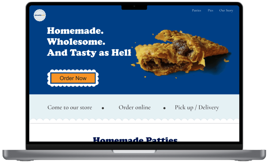
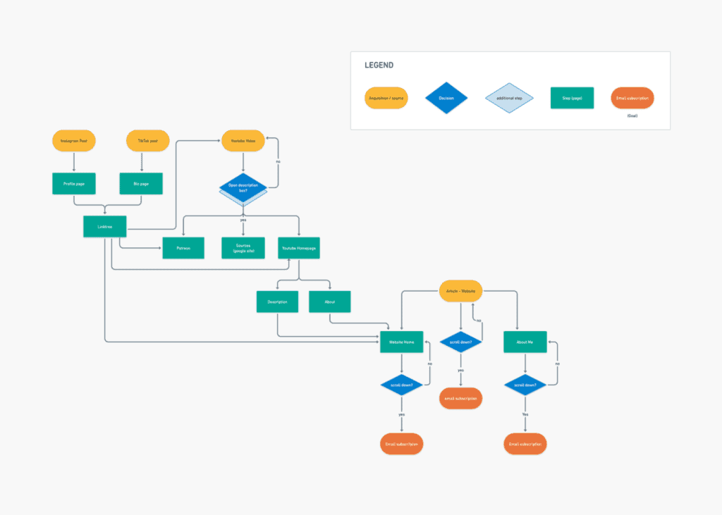
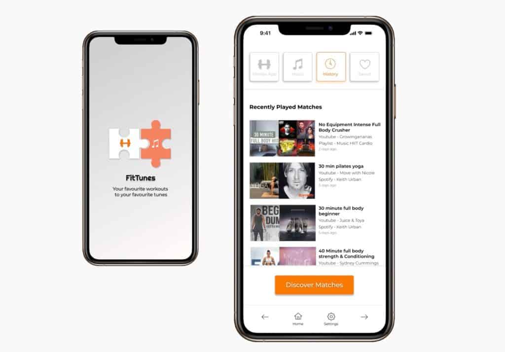
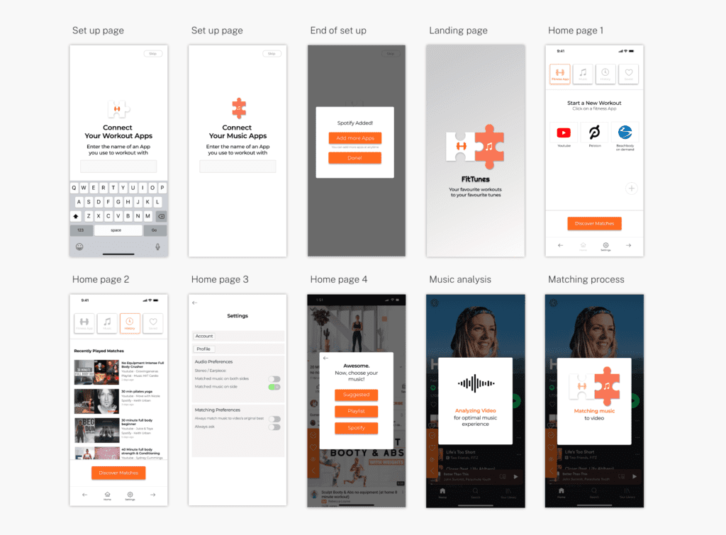
Phamilyeats is a new restaurant business with great reviews on its food, but not so much on its e-commerce site and online ordering process. I did a research on the business, industry, website and customers, in order to redesign Phamilyeats’ website and ordering platform.
Project: Ecommerce website UX/UI redesign
Client: Phamilyeats
Problem & Approach
to Solution
Problem
Peter is new in the bakery business and his shop is growing. However, customers struggle when navigating his website, especially to order.
Approach
Unlike for the previous two projects, I did a presentation to the client before proceeding to the design process. I presented my research findings and how I would approach the design process.

1. Research
- Google analytics
- Social media analytics
- Visual analysis of site
- Industry research
- Presentation to client
- Survey / Interview

2. Design
- Hypothesis wireframe
- Branding
- Wireframe
- Prototypes

3. Evaluation
- Google analytics (order metrics)


Research
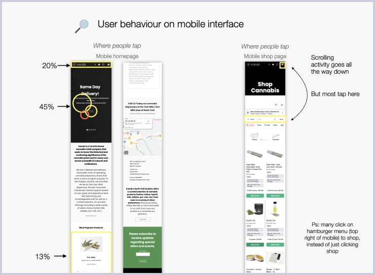
After analyzing Peter’s business (on site, website and social media) and researching industry standards, as well as his competitors, I came up with potential solutions to his problem. I gave Peter a presentation to show my findings and these potential solutions. The next four diagrams you see are screenshots of the Keynote presentation slides.
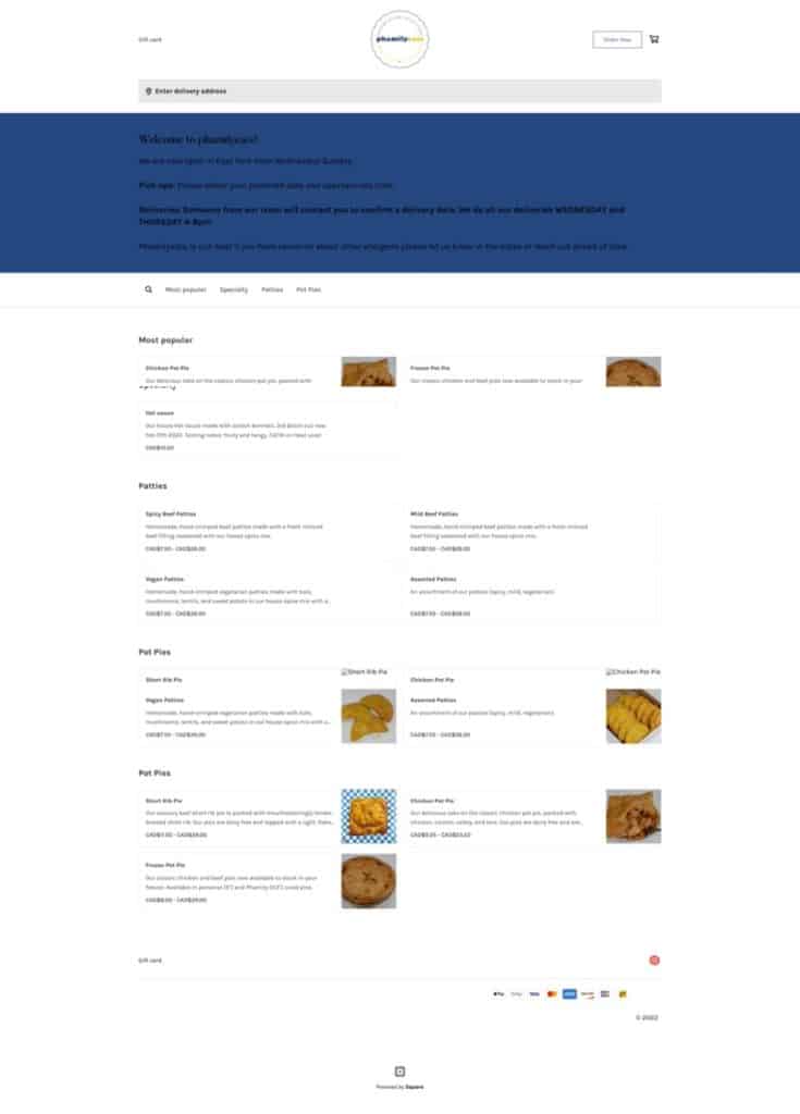
Peter's current website
Homepage
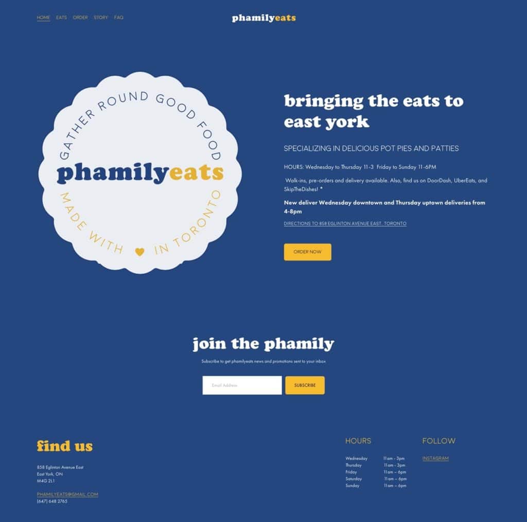
Page 2
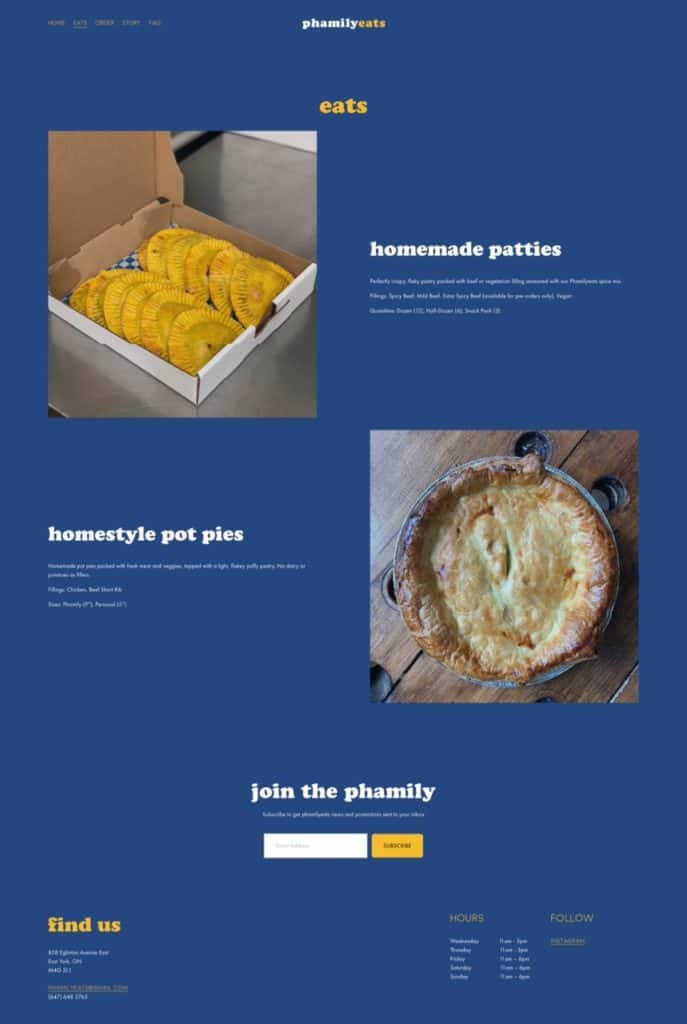
Page 3
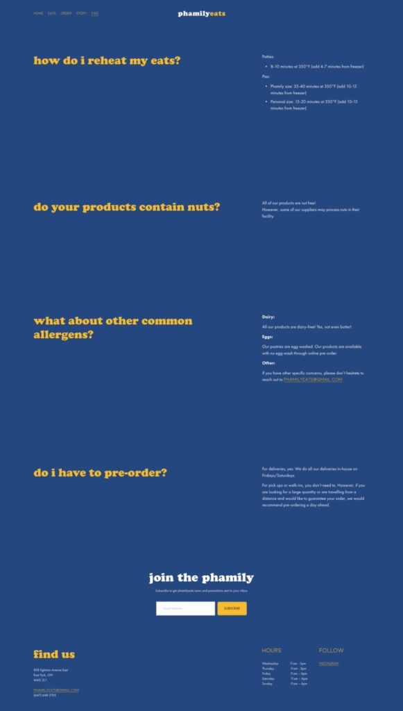
Page 4
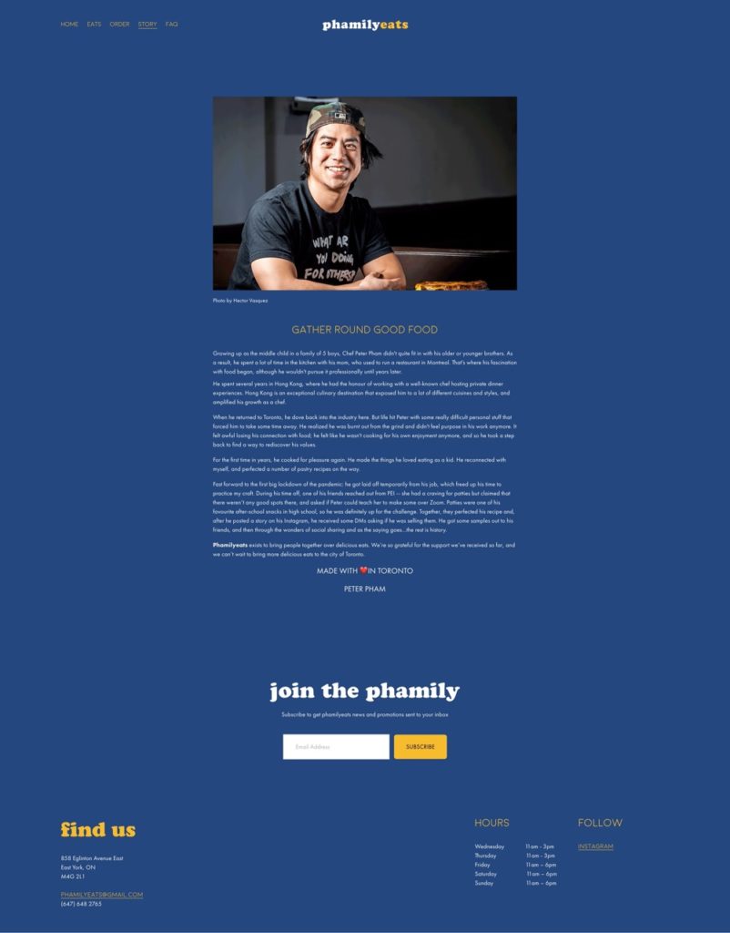
Ordering page pop up
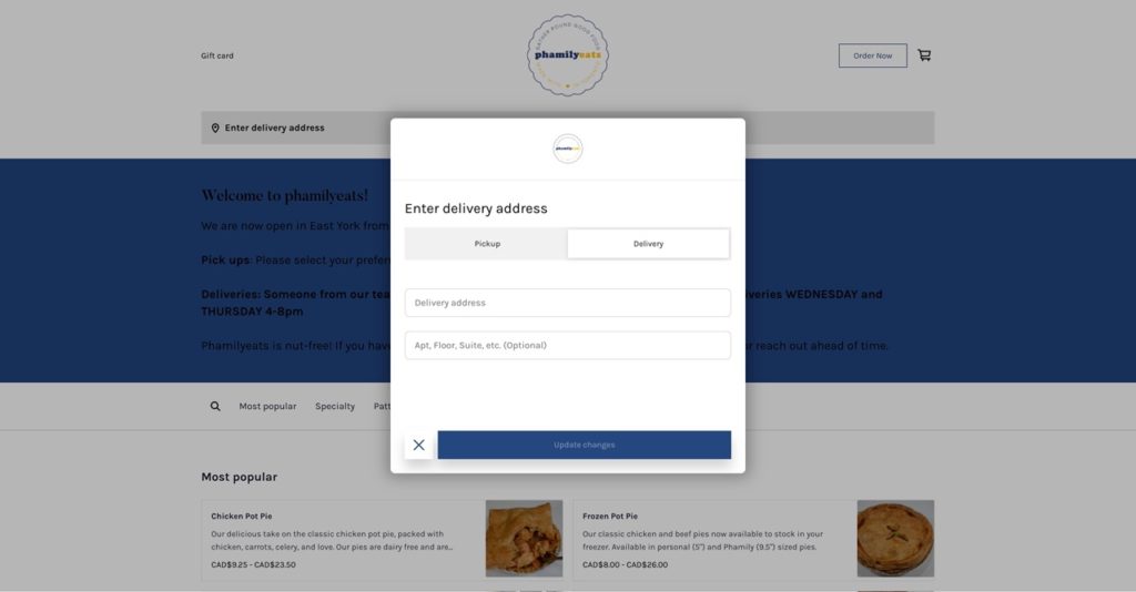
Ordering page
Presenting the findings to Peter
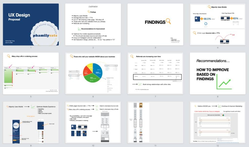
At first, I showed the most important data I found using Google Analytics (slides 4-7).
Then, I explained my recommendations on how to improve his website based on those data (slides 9-14).
Some recommendations (Slide 9-11)
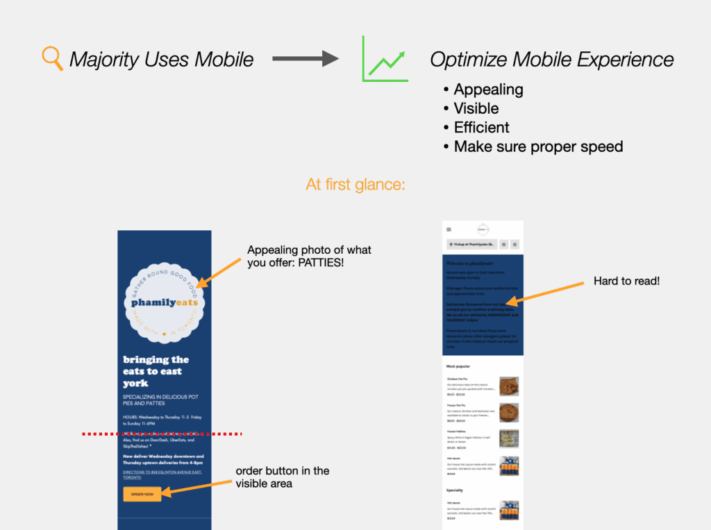
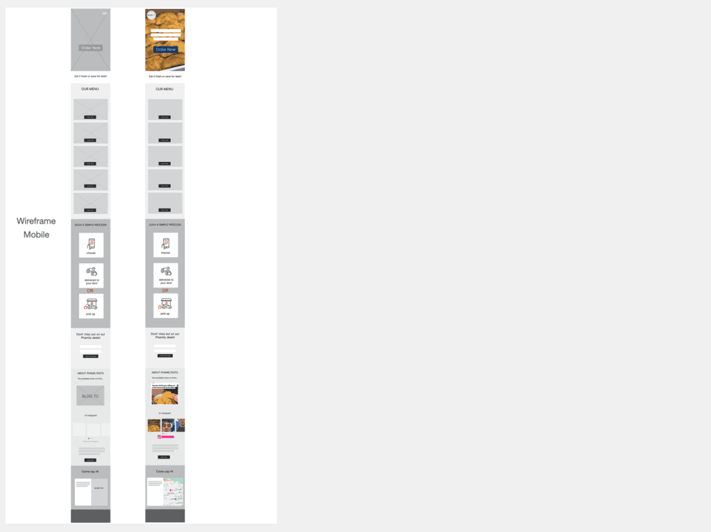
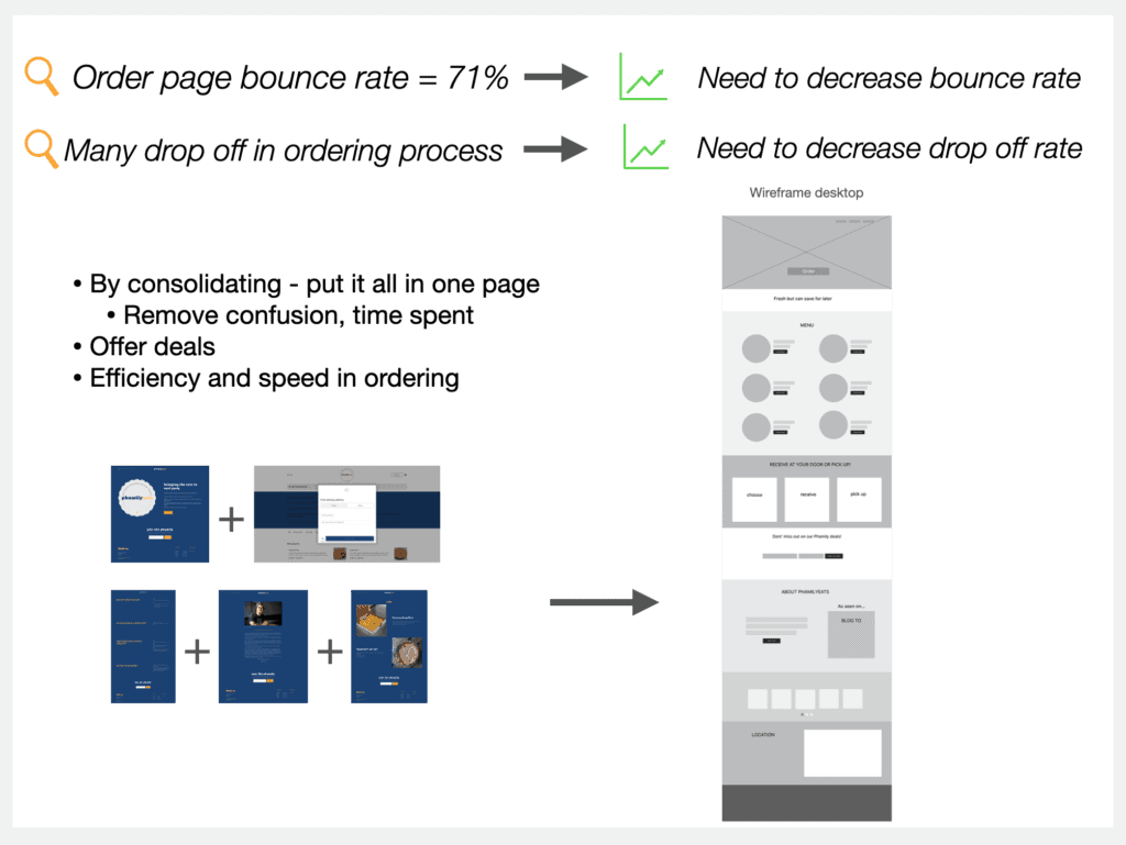
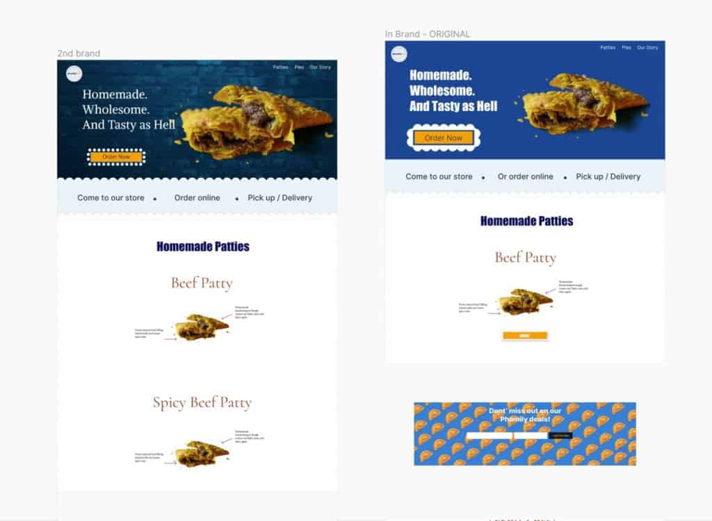
I indicated the potential problems with his site and offered a hypothetical prototype
Other things pointed out
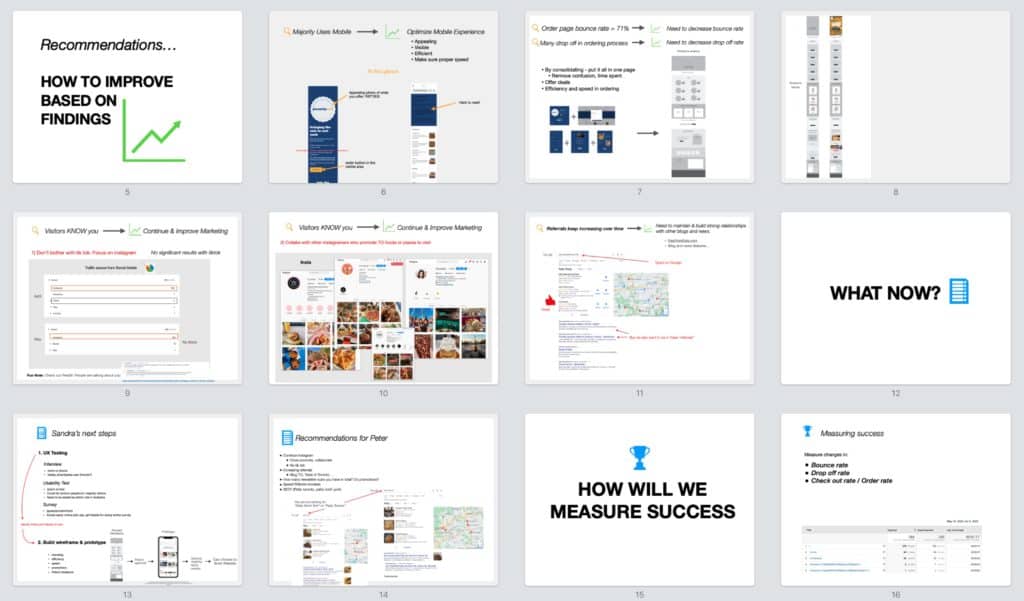
Suggested types of UX research and their reasons
Recommendations regarding social media and marketing
How we would measure success
Creating the survey
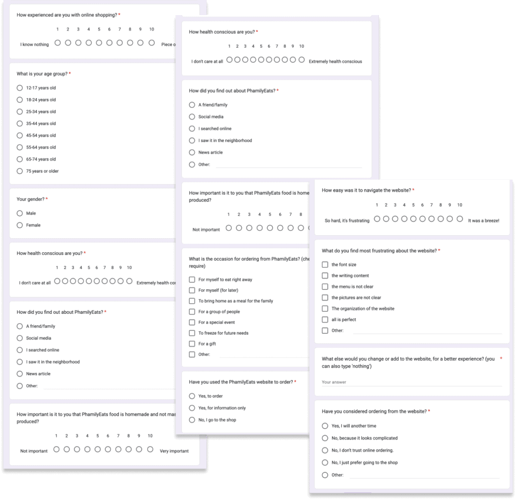
I created the surveys using Google Forms.
This step is in progress. Let’s move on to the next.


Design
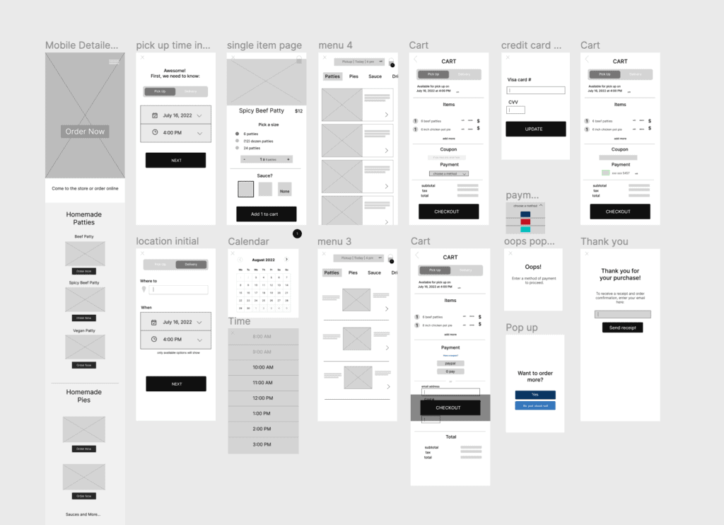
The design phase consists of identifying Peter’s brand (colour palette, fonts, designs), creating low fidelity wireframes for the homepage and ordering pages (for the latter, I focused on mobile, as it is the most used for ordering) as well as designing the prototype for the desktop homepage.
Branding
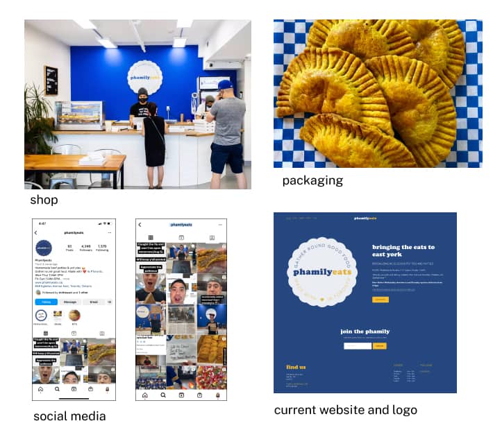
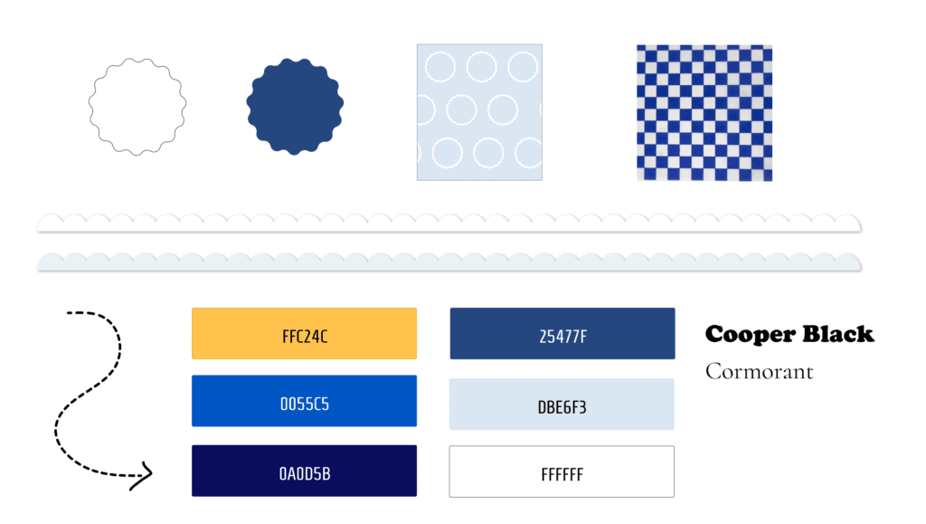
We want to keep the branding as close as possible to Peter’s shop and personality. For example, we kept the solid blue background of his shop and emphasized the circular ruffles of his logo. Peter’s Instagram account portrays him to be a fun, carefree and goofy guy. His website will embody those traits.
Wireframe re-design
Homepage
Mobile

Desktop

Ordering pages
Initial - pick up
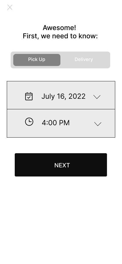
Initial - delivery
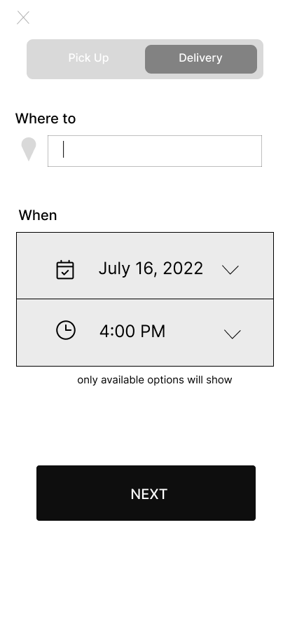
Calendar
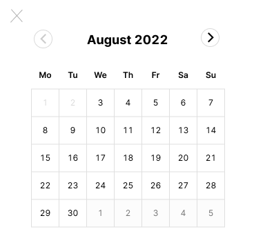
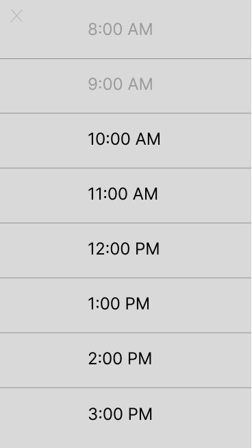
Time slot
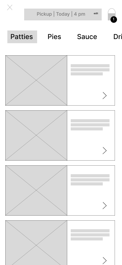
Menu - version 1
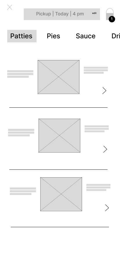
Menu - version 2
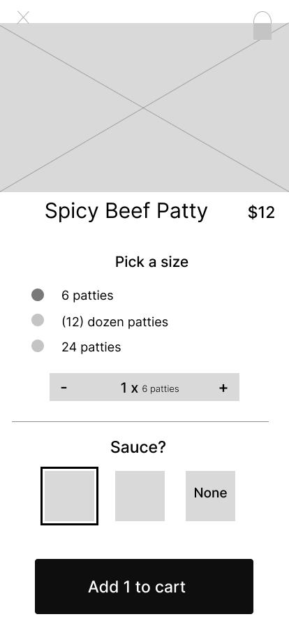
Single item page
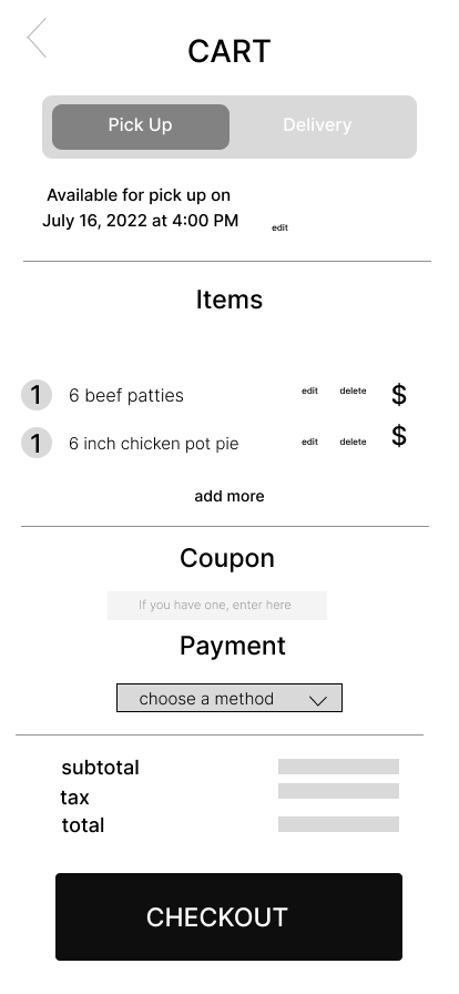
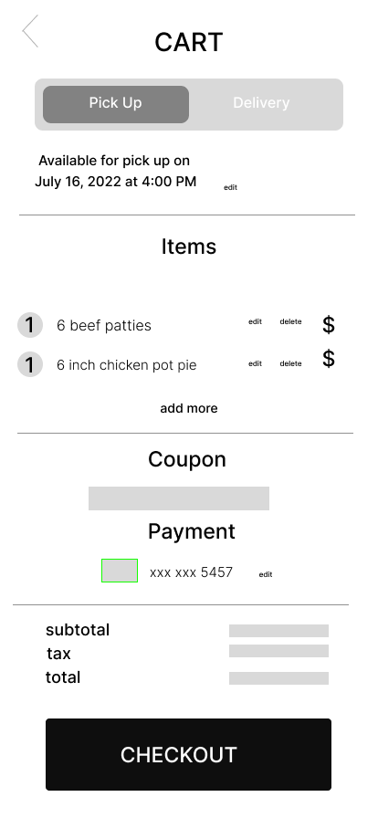
Cart - version A
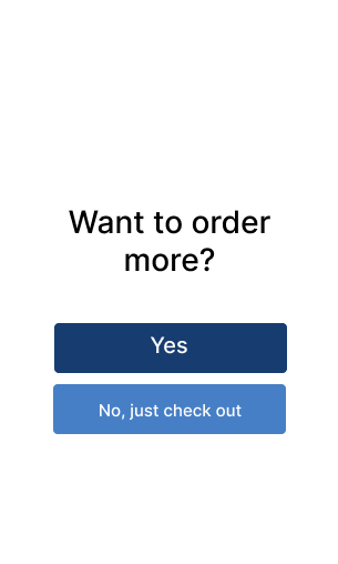
Pop up
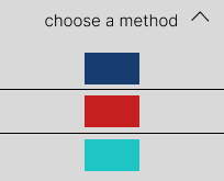
A - Payment dropdown
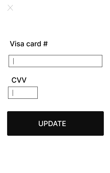
A - Credit card pop
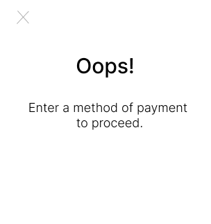
Oops pop up
A - Post credit card
A - Thank you

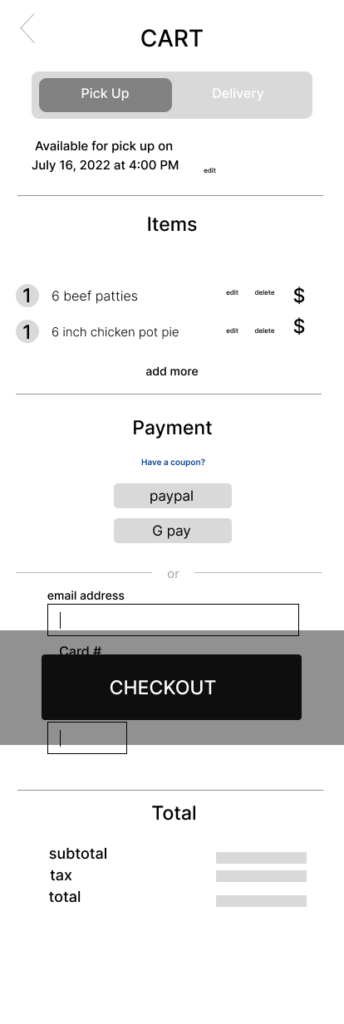
Cart - version B
Prototype
Once the prototype is approved for live implementation, we would need to take photographs of each patty/pie and replace the ones you see in this prototype. We would also need to replace some of the writing accordingly.
Home page

Reflection
The UX re-design project for Phamilyeats is still in progress. Peter had to put the research (survey) on pause due to personal matters. However, once we’re done carrying out the survey, we will make changes on the homepage and the ordering process based on the results. In the meantime, we may put the new homepage (minus the “order and you shall receive” section) live and do A/B testing with the current homepage. We could measure what effects the new homepage alone (linked to the same old ordering system) has.

