CHASING GODS
Educational Content
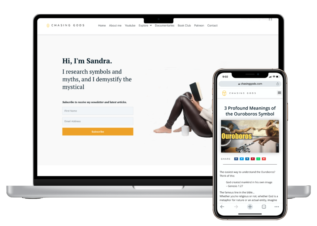
Chasing Gods is an existing website offering educational articles that required improvement in its subscription rate. Analytics and user behaviour research helped me implement UX changes to improve conversion rate.

Project: Website redesign for conversion
Problem & Approach
to Solution
Problem
The first of many problems to tackle is: The blog attracts visitors but does not get enough email subscription.
Approach

1. Research
- Business analytics
- Visual analytics
- User flow
- Hypothesis

2. Design
- Wireframe
- Prototype
- Web re-design
- User/funnel flow

3. Evaluation
- Analytics


Research
The research process is broken down into 4 parts.
1) Analytics of the business 2) User behaviour 3) Analysis of the site and 4) User flow.
From all of these, I will form a hypothesis.
The business
based on Google Console & Analytics
Each Month
380
visitors
yields
0.5
email subscription
Our goal is to increase the subscription rate
User behaviour
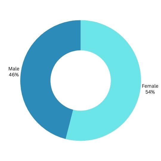
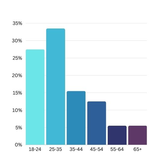
We want to know who visits the site and where do they come from. User behaviour data is based on Google Console & Analytics and Social Media Analytics
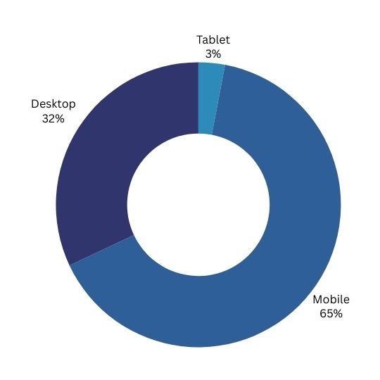
Device
Traffice source
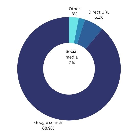
Blog source
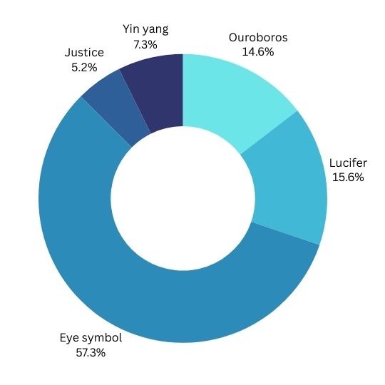
Gender
Age
Country
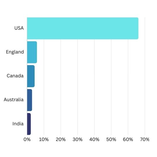
Main take-aways:
- The majority of visitors come because they were searching for information on symbolism
- The majority use their mobile phones, but there is still a good 30% who read the articles via their desktop.
- The most popular article/symbol that the site has is on the Eye.
- The target audience is the American young adult who is interested in symbols and mythology
Analyzing the site
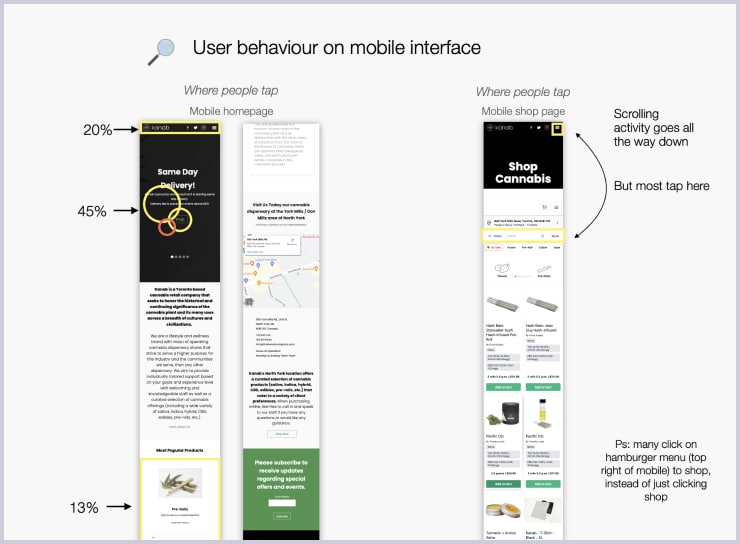
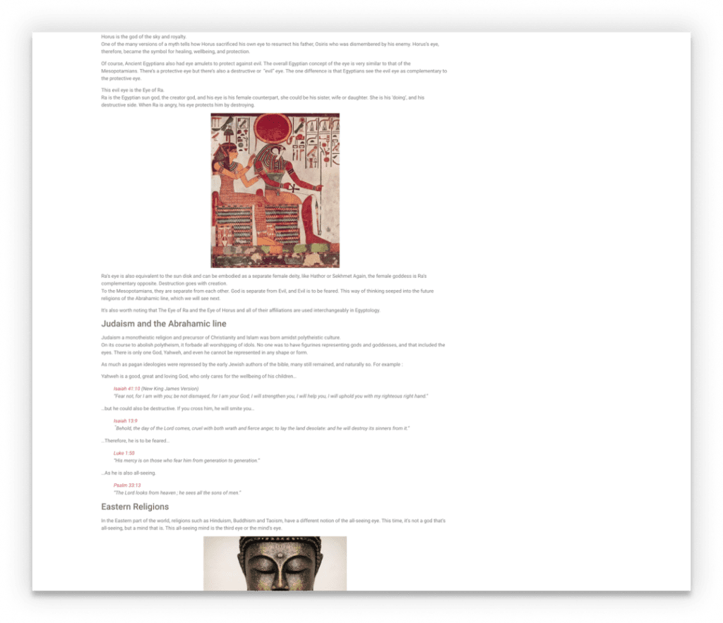
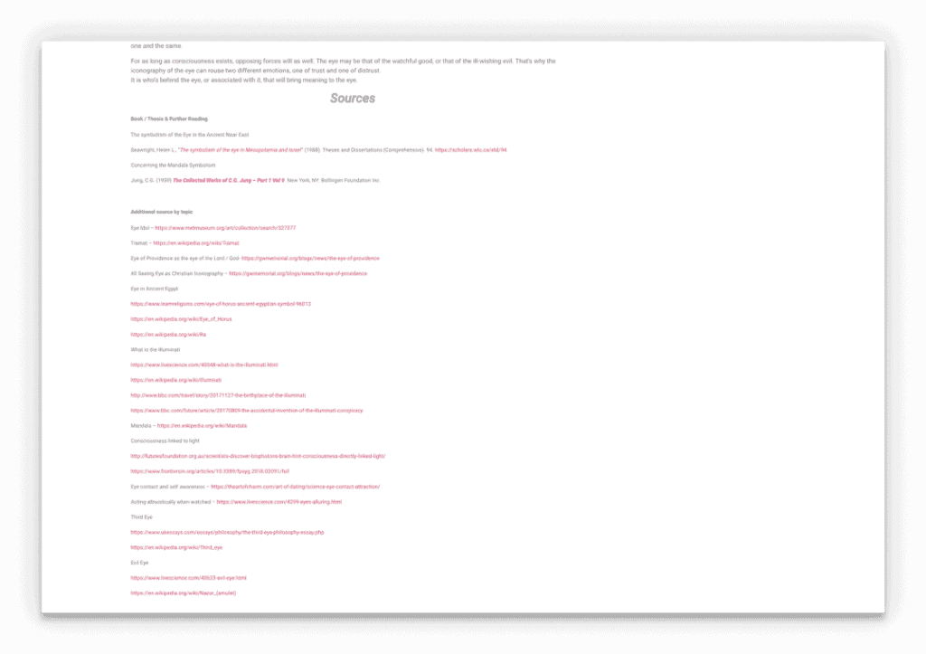
We need to understand how the target user experiences this article.Because phones are the most used device, I looked at the mobile site and noted things that could potentially inhibit subscription.
Mobile


The only subscription form is all the way at the very end after the lengthy sources section! Only those interested in the sources would have a chance to see it.
The article goes on for a very long time without any call to action (newsletter subscription form)

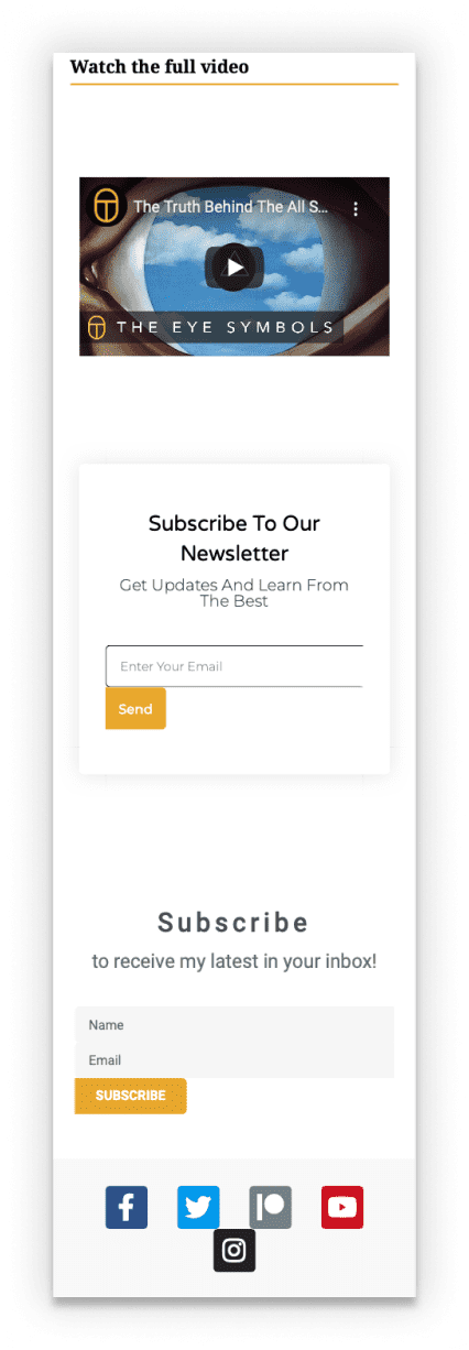

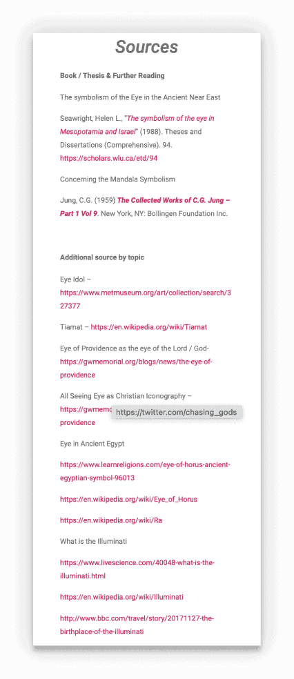
The video should be somewhere at the top with a subscription button to the channel. People who find the article most likely have no clue that the website’s biggest value are the videos.
Sources seem way too long and don’t have a proper structure
User flow
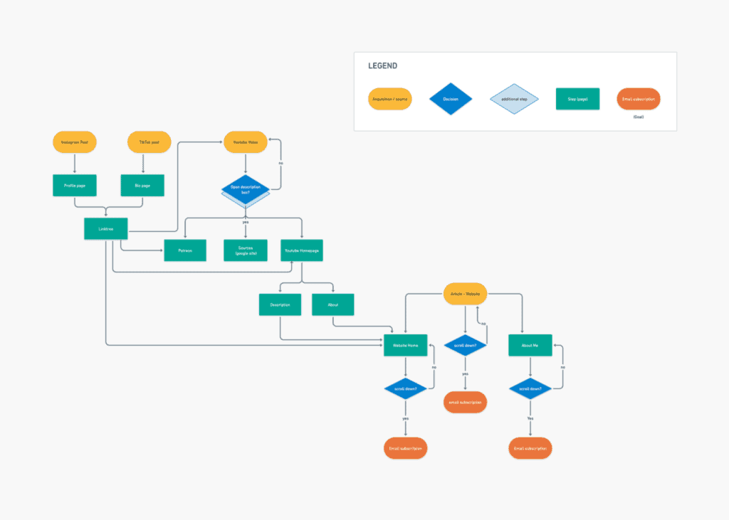
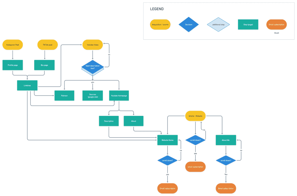
Although the vast majority of visitors come from Google topic searches, half of the email subscribers were funneled from social media. A user flow diagram was created to visualize the funneling. It is based on Google Console & Analytics and Social Media Analytics
Hypothesis
Based on the current state of the landing pages, we came up with these hypotheses

Subscription sign is not visible

Article too messy. It doesn’t promote curiosity

Call to Action not visible on social media

Bad copywriting of the subscription form

Simply not enough visitors
Now What?
Normally, I would focus on one hypothesis at a time. I would test one and measure its impact. But because this project is time sensitive, I’ll be making more than one change at once:

More visible subscription forms

Better copywriting on the subscription form

Clean up format of the articles

Provide clear call to action on social media


Design
The redesign of the website is minimal. Still, I needed to visualize a logical flow using wireframes. Then, I made the changes on the website’s homepage, as well as the posts. Lastly, I had to re-design the user flow in order to maximize subscription potential.
Wireframes
Home Page
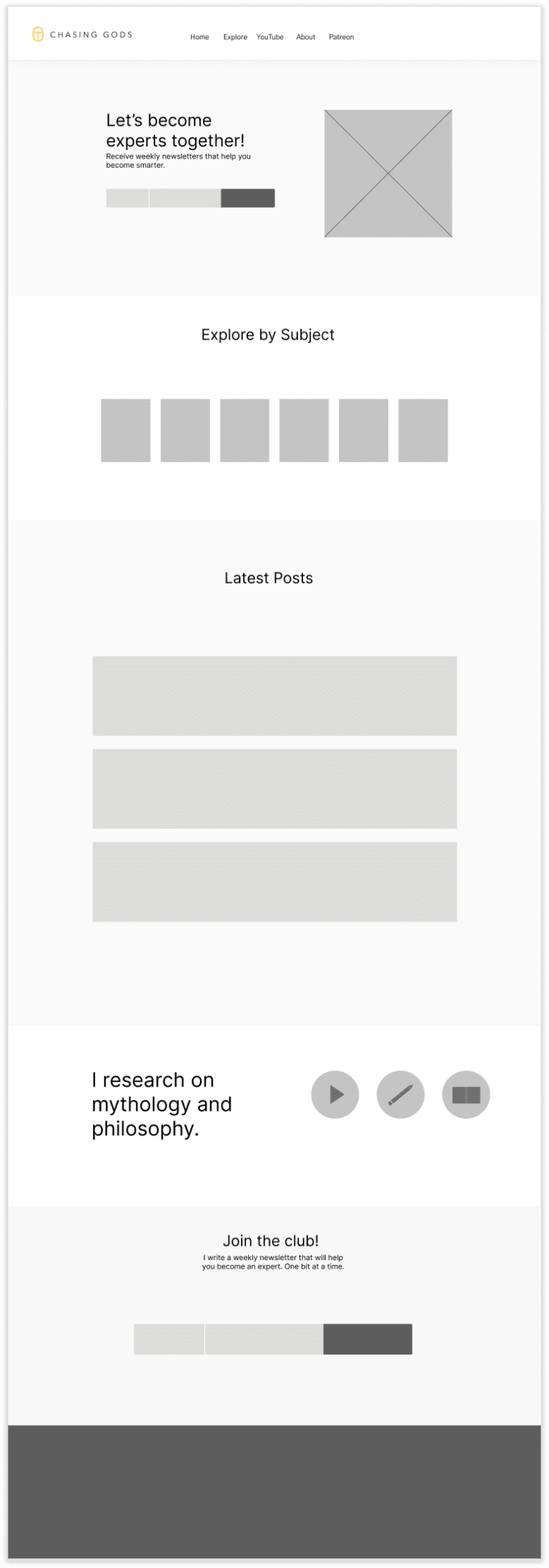
Post A

Post B

There are 2 final post styles. Post A has subscription boxes throughout the content. Post B has the subscription box on a sticky sidebar.
Web re-design
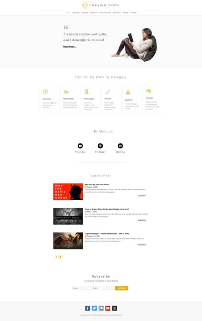
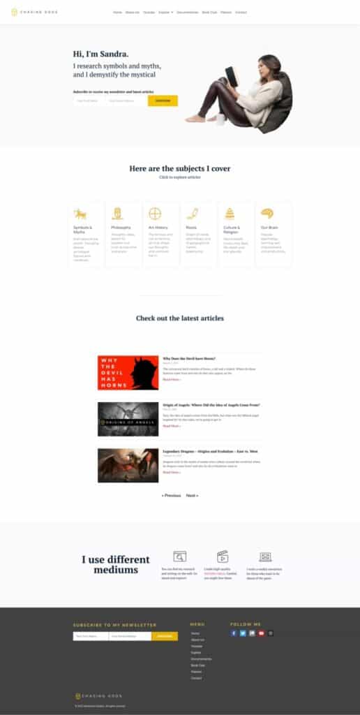
Home Page
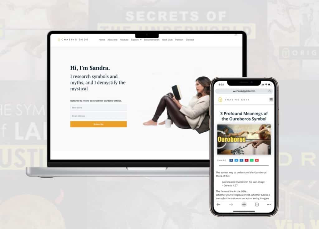
The website remains almost the same, but with subtle powerful changes. Most importantly, the subscription box has been placed in the hero area.
Original
Redesign
Post
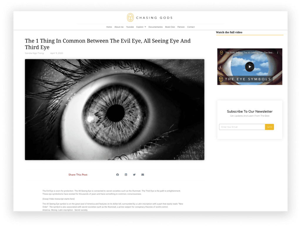
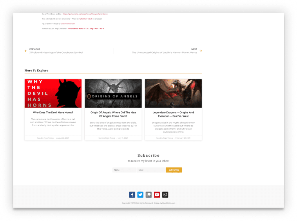
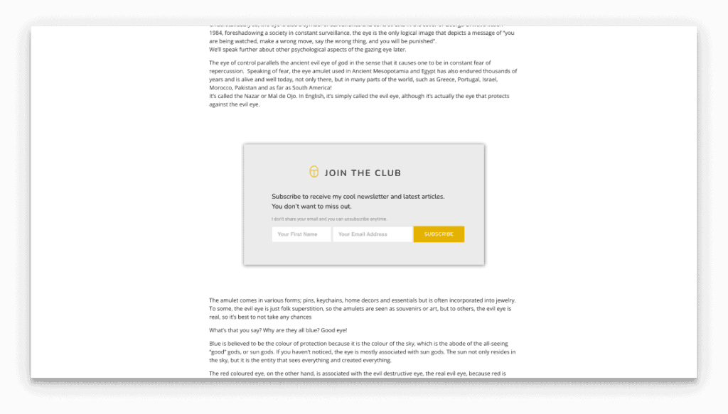
Of the two different posts styles, I chose Post A. Post B can be done as an A/B test in the future. Of the changes: the small side video is now below the first paragraph. Subscription boxes appear twice throughout the content and in the footer. The author box contains a link that indirectly leads to subscriptions.

Original

Redesign

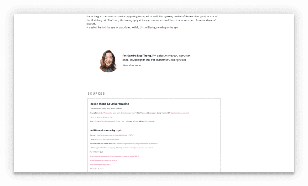
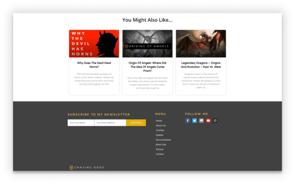
Redesigning the newsletter funnel


Evaluation
The results were collected after 4 months. It’s important to note that during this testing period, I did not publish any videos or social media content (which I did prior to this UX project). This means that there will be less traffic coming from Youtube and Social Media, which will negatively impact test results.
Before UX
After UX
based on Google Console & Analytics
380
visitors
yields
0.5
email subscriptions
based on Google Console & Analytics
380
visitors
yields
4
email subscriptions
RESULT: Redesign increased subscription by 8x
Reflection

So far, we’ve only experimented with a couple of hypotheses. There are many more to test, one of which is very important to mention – content output. A reason for not having enough subscribers could be because there aren’t enough visitors to the website to begin with, and that ultimately is a function of content creation such as articles, youtube videos and social media.
In terms of UX research, another avenue I’d like to have Chasing Gods consumers participate in surveys/polls. The marketing of such would be done via social media, the youtube channel and perhaps on the article landing pages as well.
The UX project on the Chasing Gods educational web content is not only ongoing but a long-term one, with eventually monetization as a goal metric.
Also, because of the above, the test cannot be measured by time, but instead, by the number of web visitors.


