kanab
Cannabis dispensary

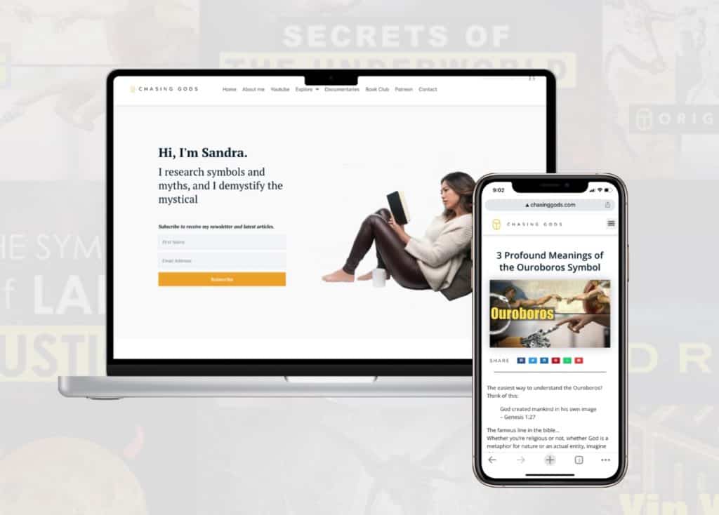
Chasing Gods is an existing website offering educational articles that required improvement in its subscription rate. Analytics and user behaviour research helped me implement UX changes to improve conversion rate.
Project: UX Research & Website redesign
Client: The Kanab Company
Problem & Approach
to Solution
Problem
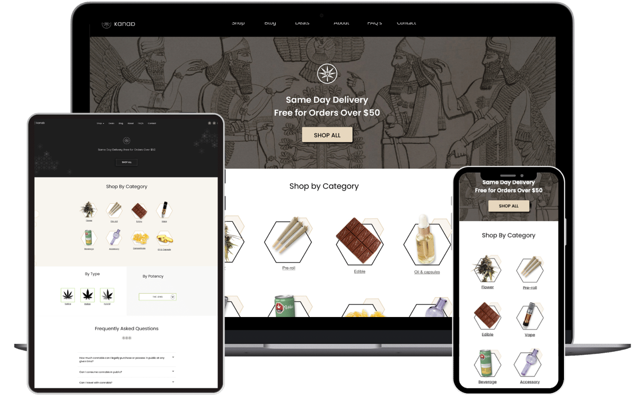
The competition is increasingly high for cannabis dispensaries in Toronto. The owners of Kanab wish to optimize their digital approach in order to deal with this competition. They are open to research-backed advice, as well as a website re-design
Approach
A full array of research was conducted in order to analyze the client’s current digital presence, business competition, user needs and friction. Based on the insights, a re-design of the website was drafted while accentuating the physical business’s branding.

1. Research
- Website heuristics
- Web traffic analytics
- User interview
- Social media audit
- Newsletter audit
- Market research
- Competitor’s online practice

2. Design
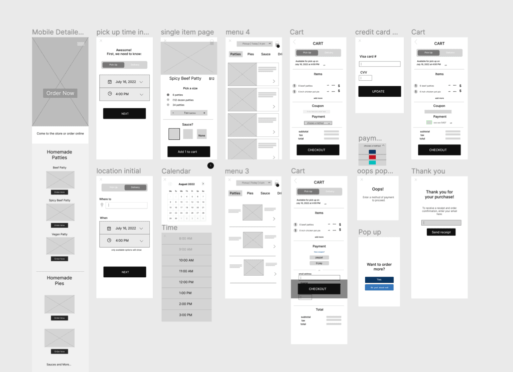
- Wireframe
- Identify branding
- Prototypes
- Social media plan

3. Evaluation
- Web traffic analytics


Research
The insights provided are limited due to confidentiality. Measuring the traffic data of the website, not only gives us behavioural insights, but also allows us to compare them with our hypothesis based on heuristics analysis.
Heuristics
Previous Desktop
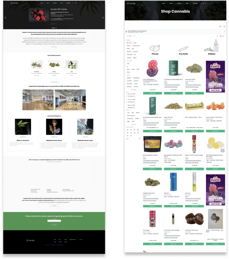
The website has a consistent color branding but no customized branding. It uses a third party e-commerce iframe. Most cannabis dispensaries do due to the nature of the industry and its limitations with the OCS.
- Attractive image
- Bigger button
- Less content, more engagement
- Discount
- Social media
Previous Mobile

Some analytics
Once market research was done, we looked at an array of analytics regarding the traffic coming into the website.
Some noteable stats:
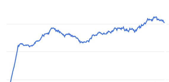
Nice, steady, increasing growth in traffic over the year!
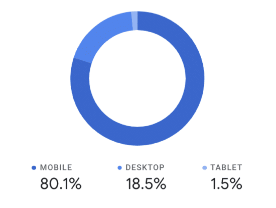
most visitors are mobile users
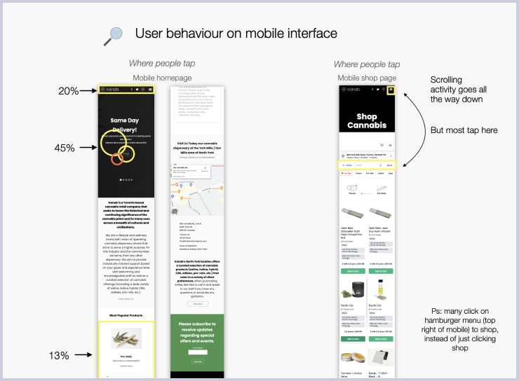
We looked at the visitors behaviour on the websiste, most noteably, mobile site.
- where these visitors are coming from
- where they are spending their time
- how much time to they spend
- how soon are they leaving
- parts of the site not well understood by the user
- are they interacting with the site?
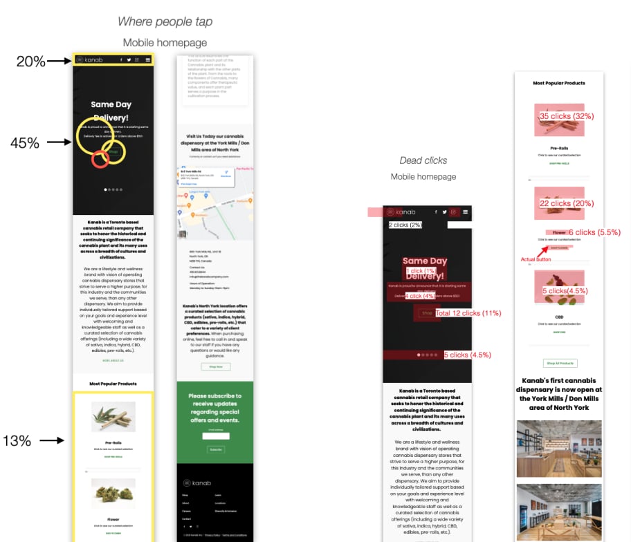
Some of the ways we looked at the user interaction with the site is by looking at the clicking behaviours. Where they click the most. And where they click without any results (dead clicks)
User Conversions
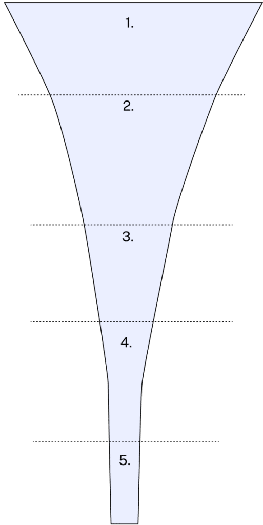
We need to know the conversion rate at each level of the purchasing journey. With x amount of visitors entering the website (1), how many view the shop. Of those, how many view their cart. Of those, how many checkout. Of those, how many see the thank you page, which means that they purchased a product.
- visitors
- view shop
- view cart
- guest checkout
- thank you page
After collecting x months worth of data, we observed that 7.5% of the total visitors convert.
We want to increase that conversion rate
Interview
Knowing what’s going on in the minds of cannabis consumers is key to understanding what makes a good purchasing journey
We recruited 9 interviewees. Among them are:
- 2 super chronics (smoke multiple times a day)
- 2 chronics (smoke every day)
- 3 weed smoker (smoke 1-3 a week or on weekends)
- 2 oil sleepers (smoke once a month or less)
Of them some:
- shop at dispensary only
- shop online only
- shop both at dispensary and online
Note: blurry for confidentiality
The questions we asked:
- why do you choose to purchase at a dispensary over online and vice versa.
- how do you chose your store
- what are your struggles and pain points
We also discussed about:
- discount
- interraction, use, attitude towards cannabis
- opinion on suggested canabis tools
- key terms used when searching for canabis

Organic searchability and competition
Based on our interviews, cannabis use key term x, y and z. We did a search using those key terms and looked at:
- where does kanab rank if at all
- who ranks on top organically
and we do an analysis of them
Blurry for confidentiality
Important to note that only 2 of those 6 shops were comparable to Kanab as they too operated 1 shop.
We analyzed 6 shops that resulted first organically, based on those key terms. We analyzed:
- their choice of 3rd party e-commerce
- Aesthetics of the website
- discount or loyalty program
- privacy liability
- Blog
- functionality
- Speed
- operations
- ratings
- the amount of stores
this along with complete social media and newsletter audit, helped pinpoint areas of improvement and design


Design
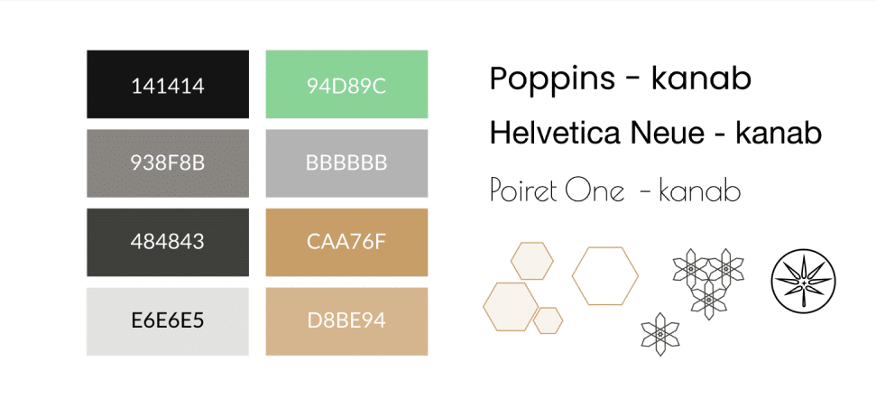
The user research findings helped shape our wireframe design. We then identified the brand identity of the business and integrate it into our improved website prototype.
Branding
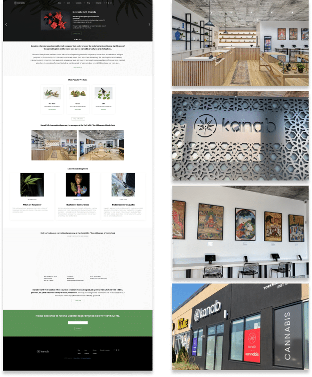
Previous Desktop
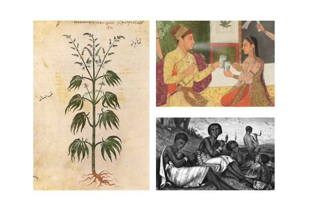
We kept the integrity of Kanab’s existing branding; the overall colours and simplicity of the website, the neutral colours (beige and grey) of the shop, the geometrical designs at the entrance, the simple black-ness of the front of the shop, and especially the ancient art from different cultures.
Prototyping
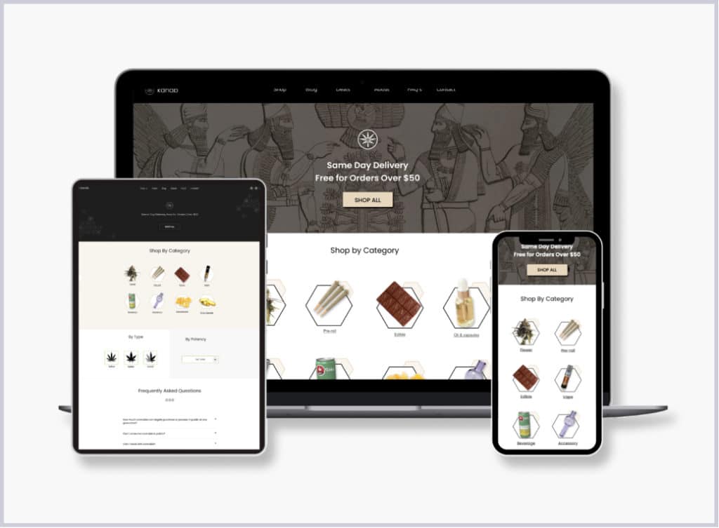
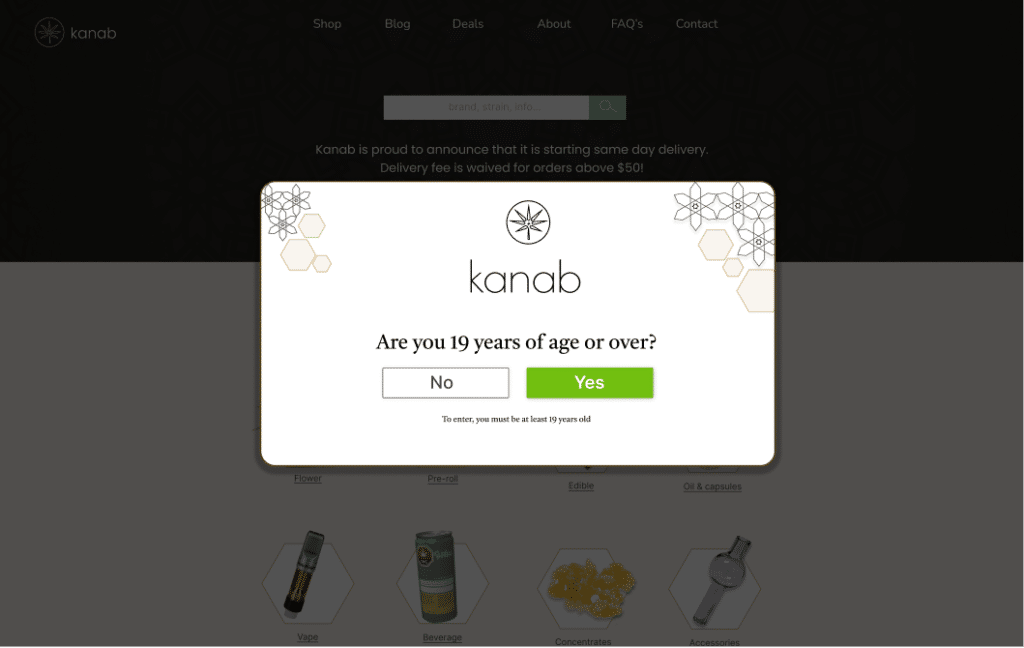
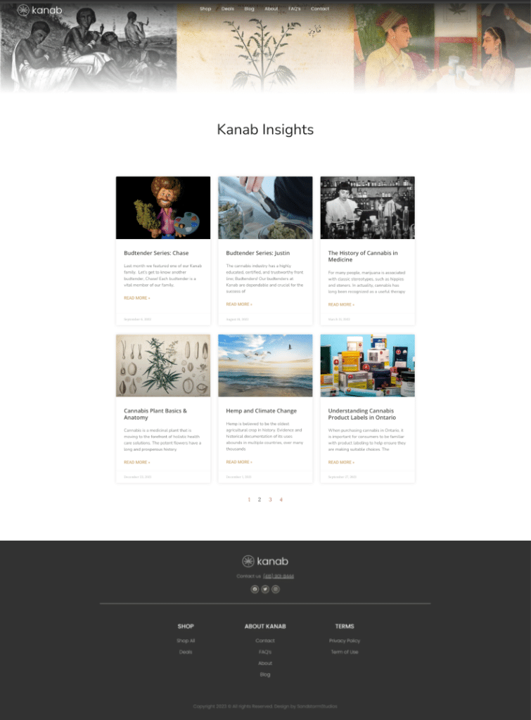
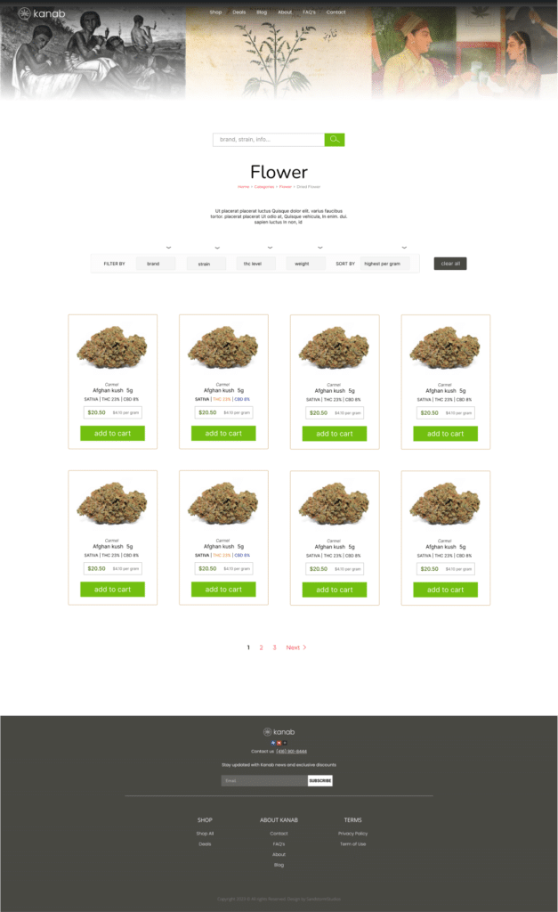
Below are some of the pages of the Kanab website. For showcasing purposes, we’ve applied the final designs to them. For example, both “mobile” and “desktop” interfaces exhibit the homepage, however they have 2 different designs. The client ended up choosing the design seen on the desktop
Mobile - home

Age restriction
Desktop - home

Blog
Shop


Evaluation
Implementation is still in progress.


