The Lunch Lady
School Lunch Ordering Platform
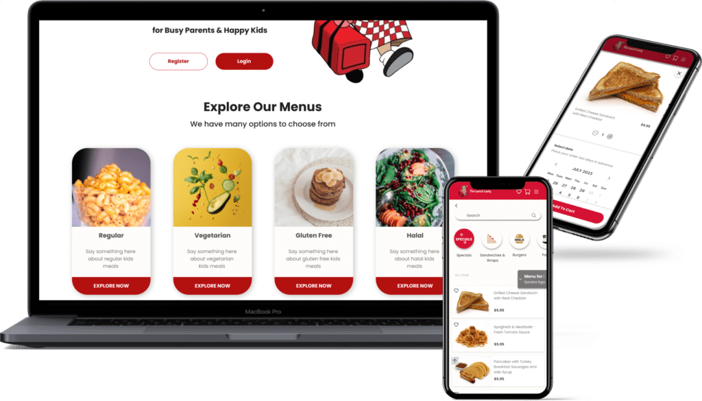
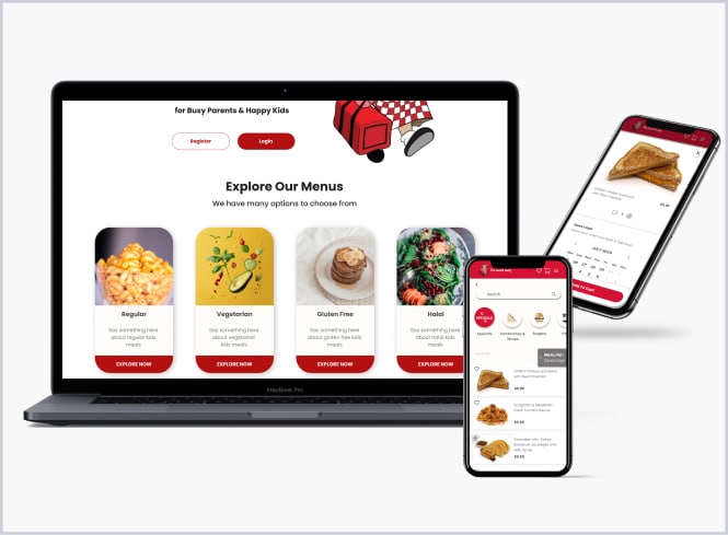
The Lunch Lady is a food ordering platform designed to facilitate parents and their children in ordering breakfast and lunch for school. As part of the expanding franchise, there was a need to enhance the current ordering web application. Our team conducted usability tests to inform the redesign of the platform’s interface, ensuring it aligns seamlessly with user needs.
Project: UX Research & Web Application Redesign
Client: The Lunch Lady
Team: Sandstorm Studios & Trish Create
Problem & Approach
to Solution
Problem
Although long-term customers appreciate the service provided by the Lunch Lady, there have been notable concerns regarding the usability of the ordering platform. Some processes were found to be redundant, or, simply put, not user-friendly.
Approach
To revamp the platform, we conducted user research, more specifically usability testing, on the current web application. This informed our initial design iteration. Subsequent usability tests guided us to refine the prototype further.

1. Research
- Usability testing

2. Design
- Wireframe
- Identify branding
- Prototype

3. Evaluation
- Through subsequent usability testing
- (iterate cycle)


Research - Usability Test #1
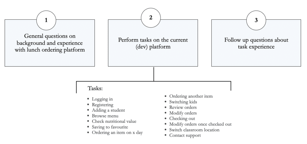
Usability tests identify friction points in the ordering application, providing insights into user pains, needs, and preferences.
Participant Profile
- 5 participants
- Demographic: parents who uses a 3rd party school-lunch ordering platform for their children.

How we did it
- Method: Video call
- Who: Tester & participant
- Where: On the Lunch Lady dev platform
Test Results
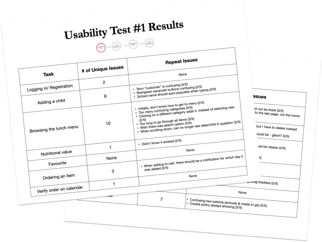
We recorded the number of unique issues encountered for each task that the user had to complete. Additionally, we documented the details of repeated issues when the same problem occurred more than once. If repeated issues happened at least 60% of the time, they were considered high-priority issues.
Examples of common user pains
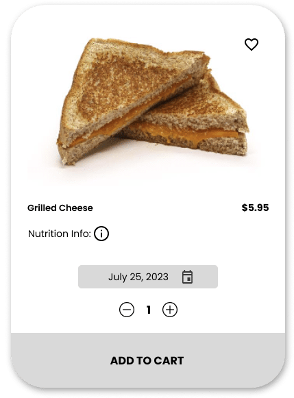
“The menu has too many confusing categories”
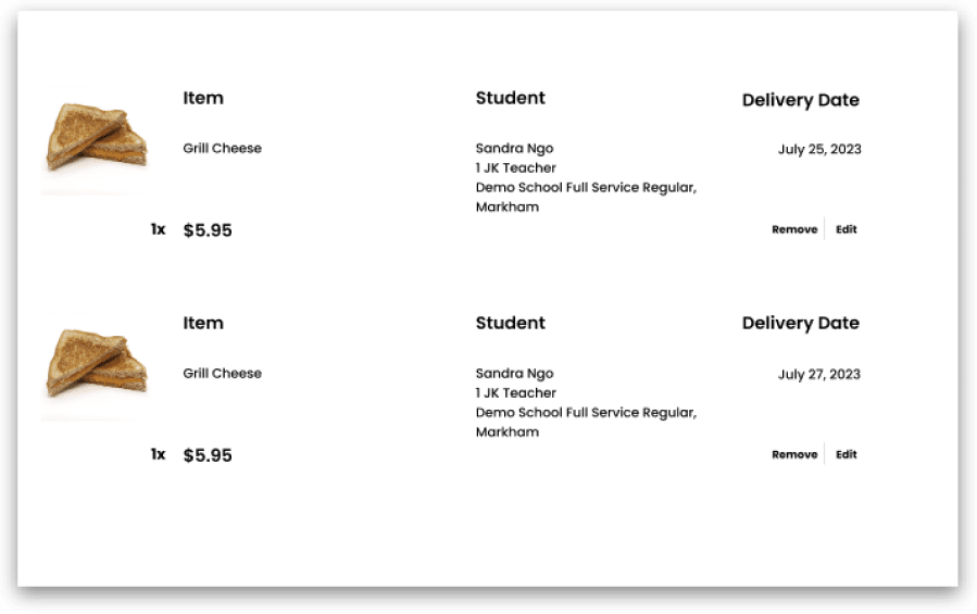
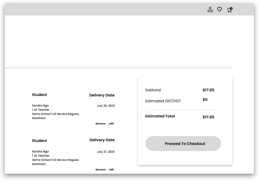
“I wish I could change the date on the cart, but I have to delete it instead “
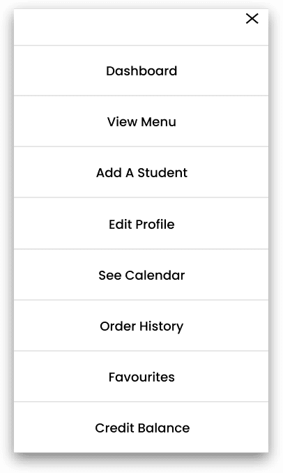
“Initially, I don’t know how to get to the menu”


Design
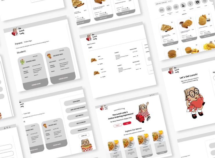
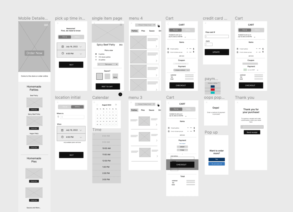
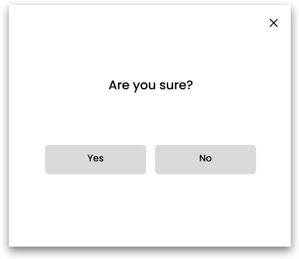
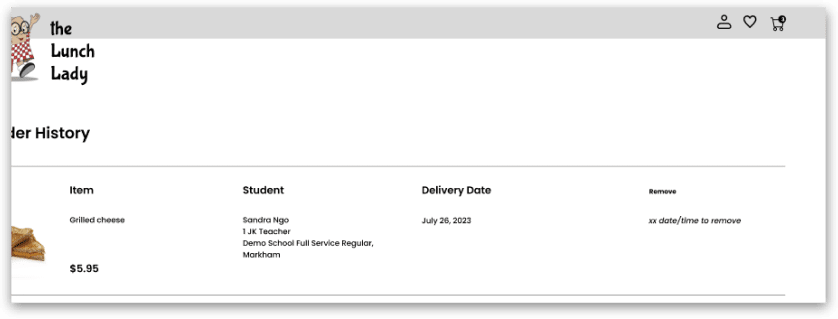
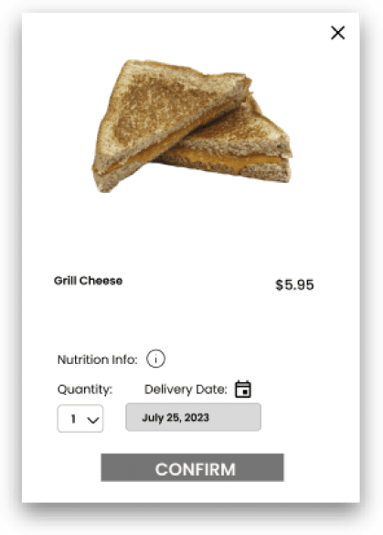
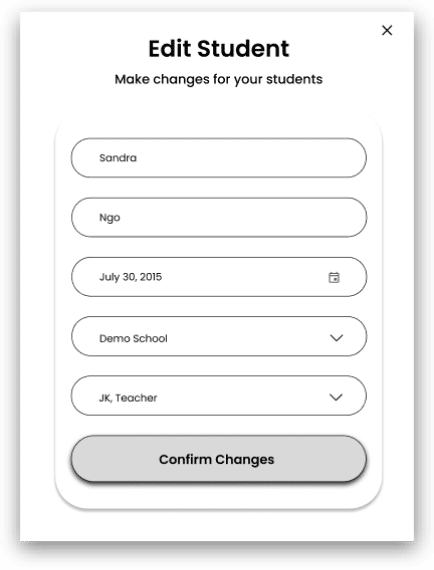
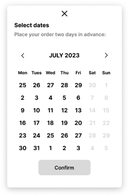
We developed design solutions based on identified user pains, creating wireframes and prototypes using Figma and design systems. While one partner (myself) conducted usability tests, the other began working on the branding and components of the design system.
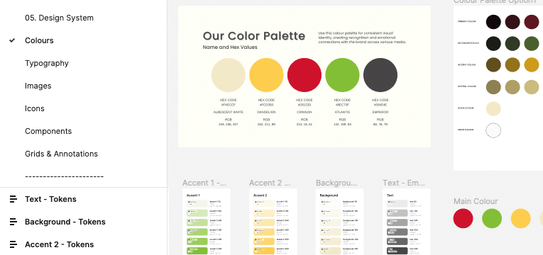
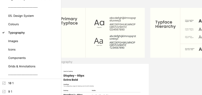
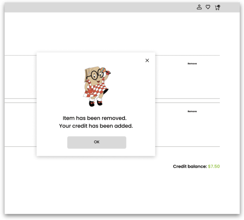
Examples of wireframes







Evaluation
To assess the impact of our initial usability testing, we conducted a second series, using the wireframes as the testing objects this time and involving a different set of participants to avoid biases.
How we did it
- Method: Video call
- Who: Tester & new participant
- Where: On Figma platform using wireframes
Usabilty Test #2 - Results
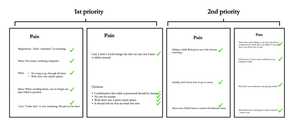
All 1st and 2nd priority pains were addressed in the making of the lo-fi wireframes, and according to the usability test #2, all were resolved. (Usability test #2 also raised new pain points, which have been addressed in the making of the prototype).


Design
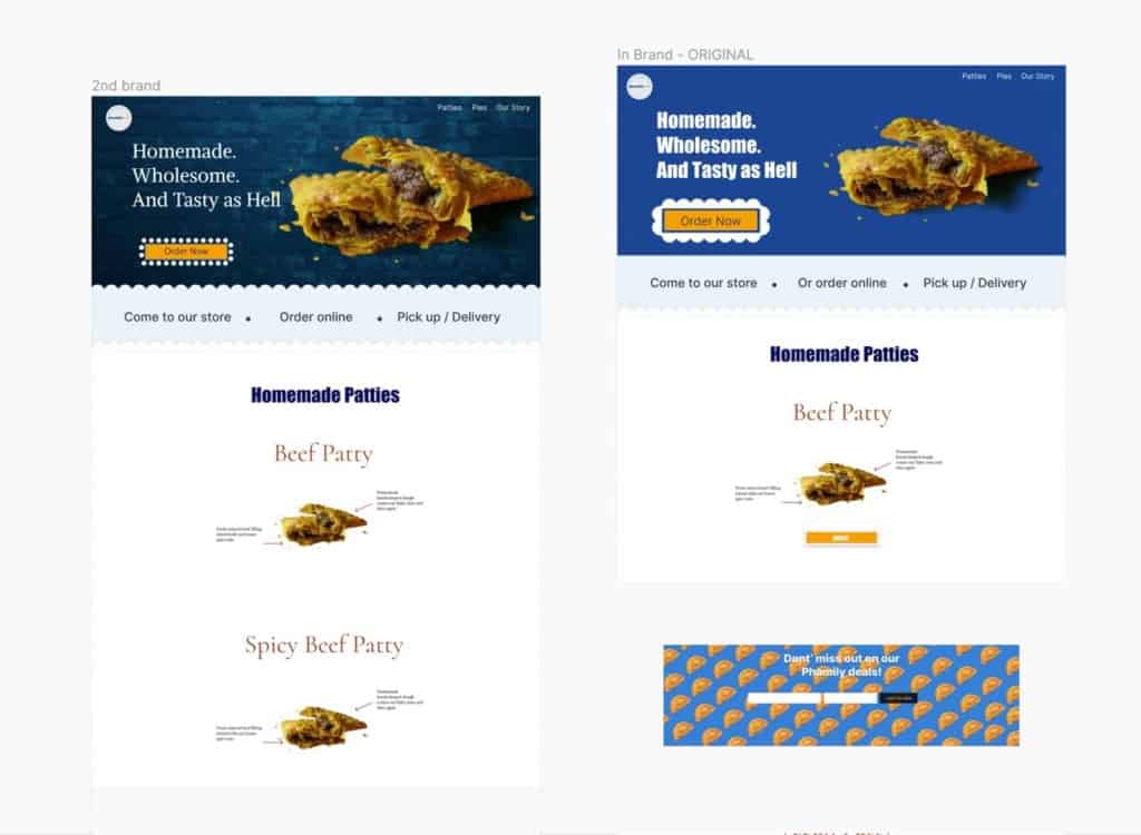
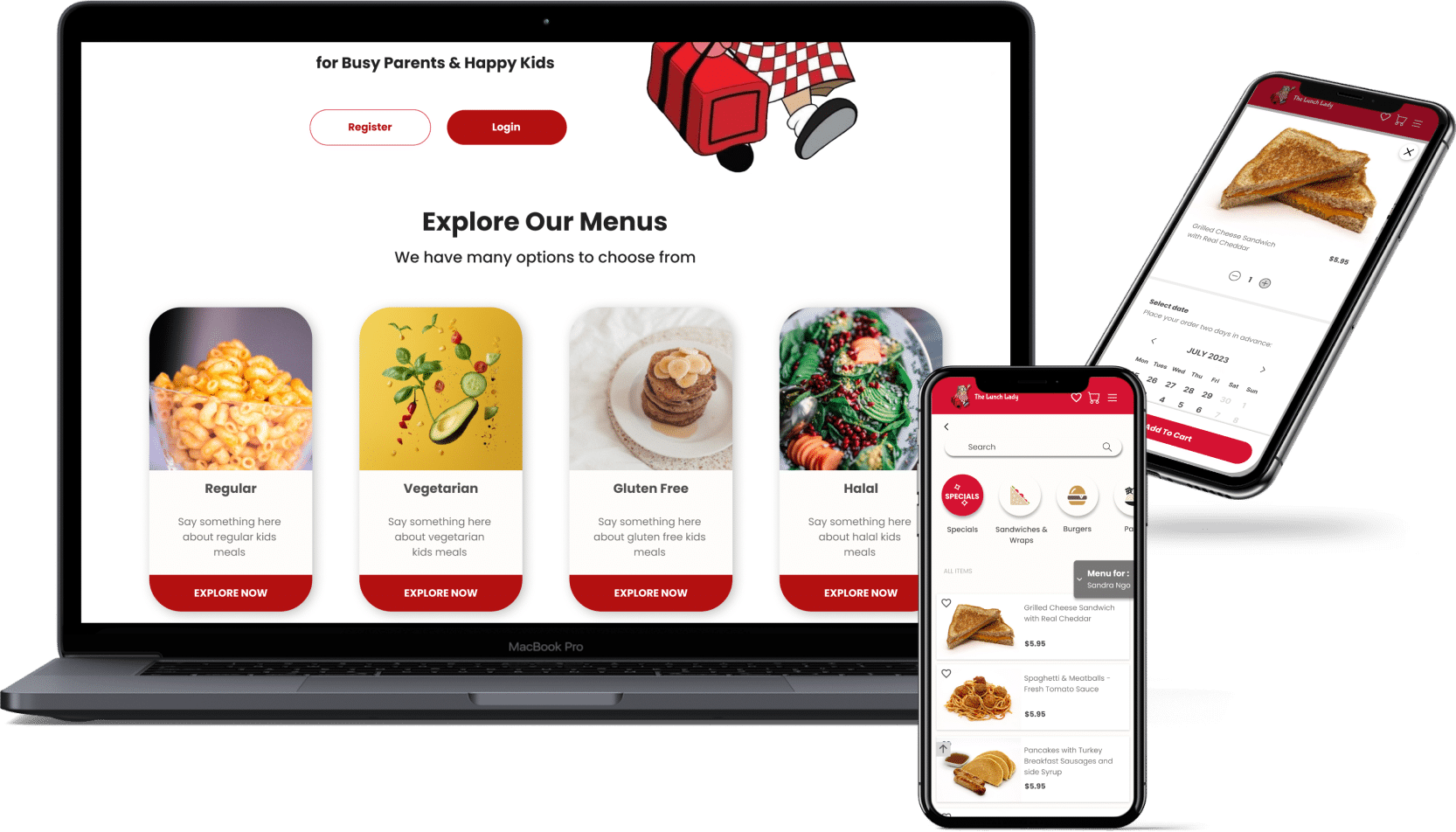
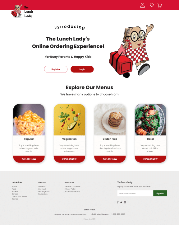
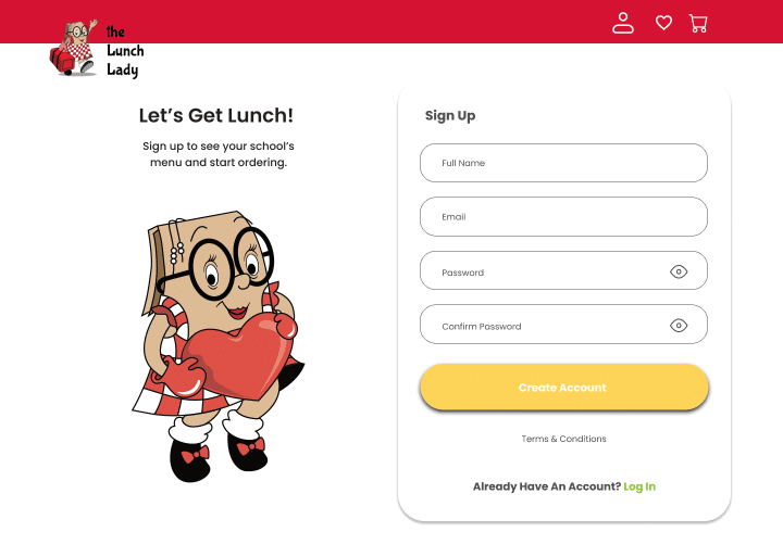
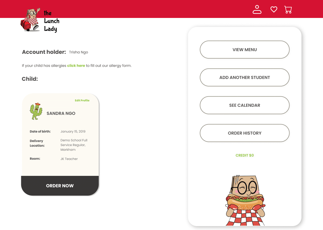
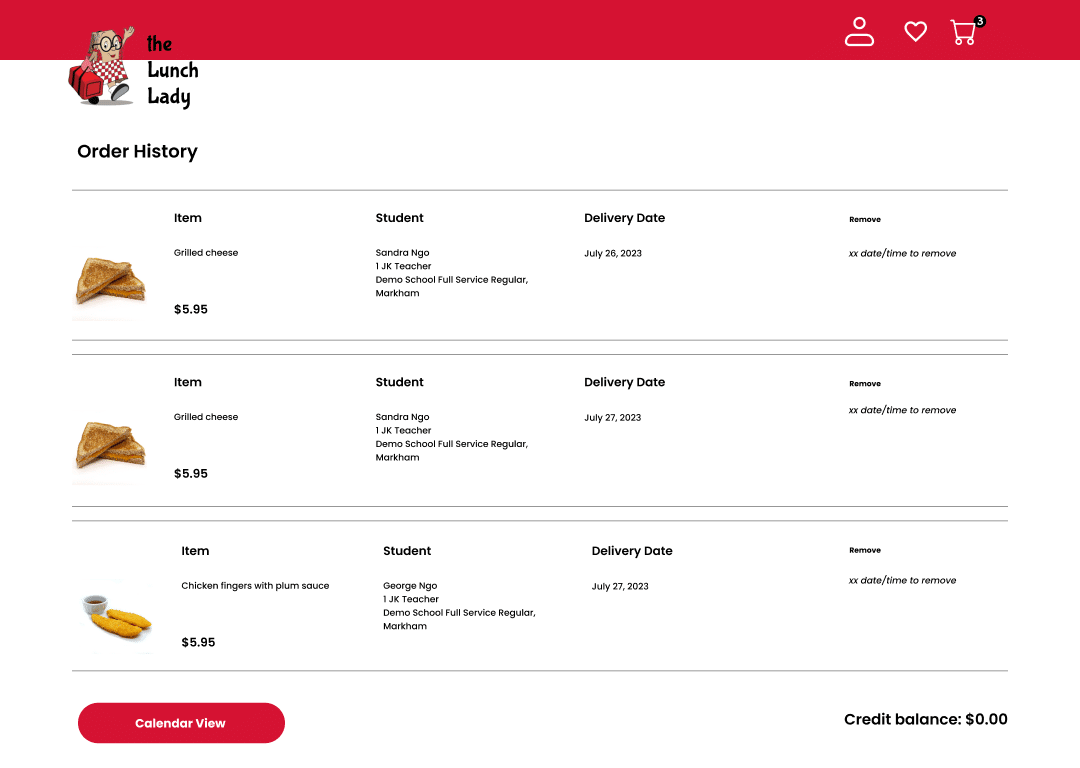
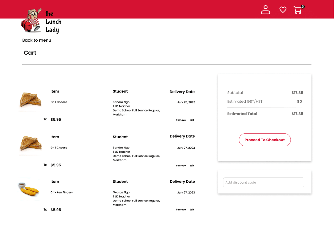
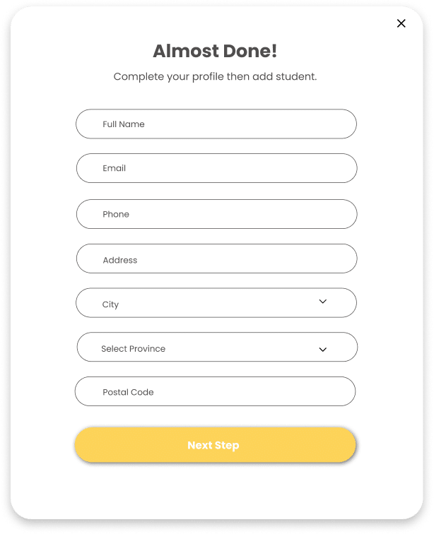
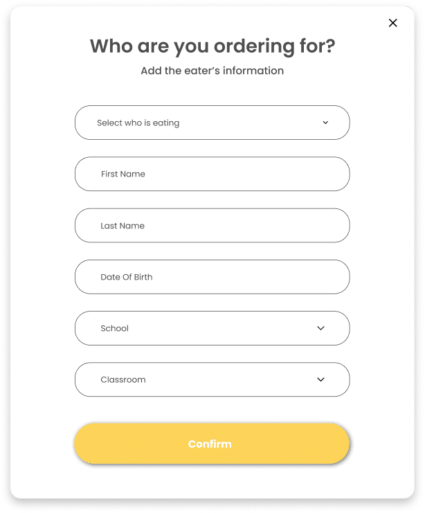
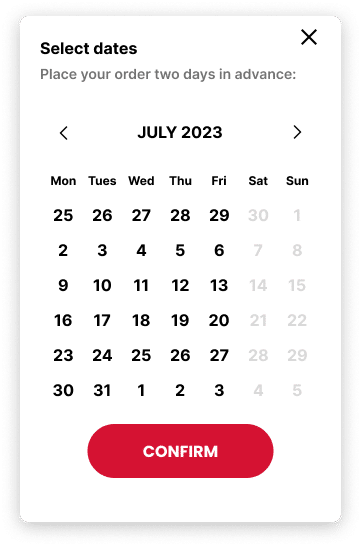
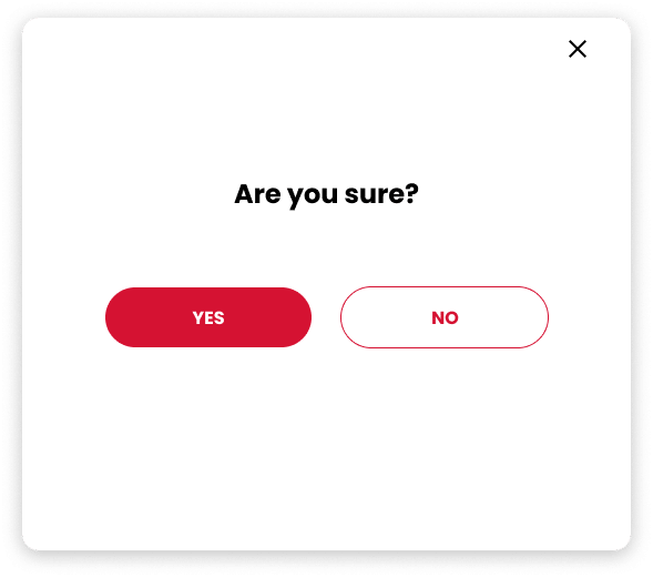
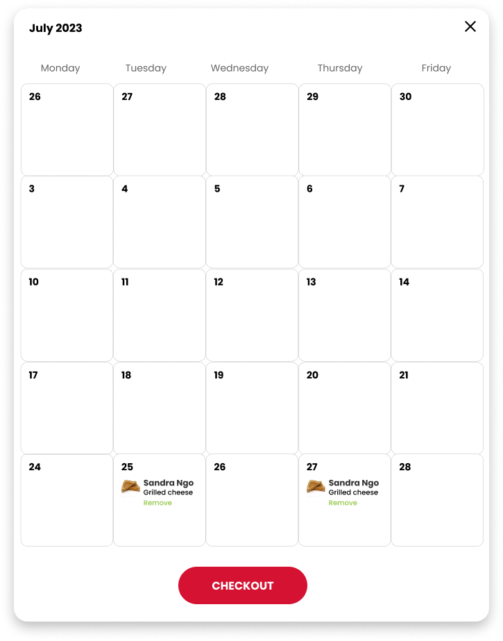
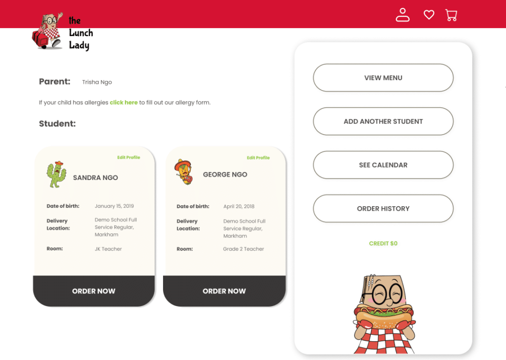
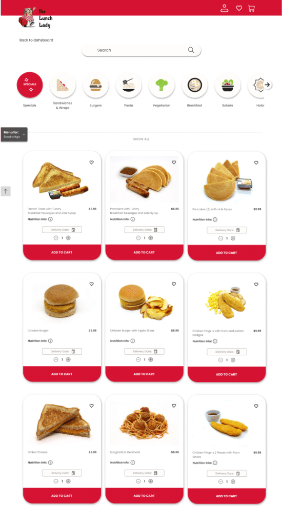
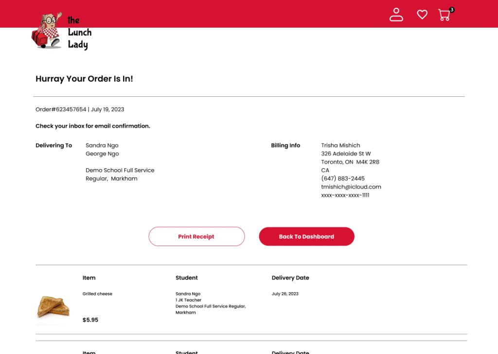
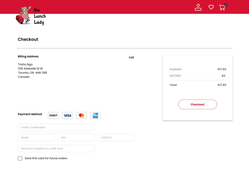
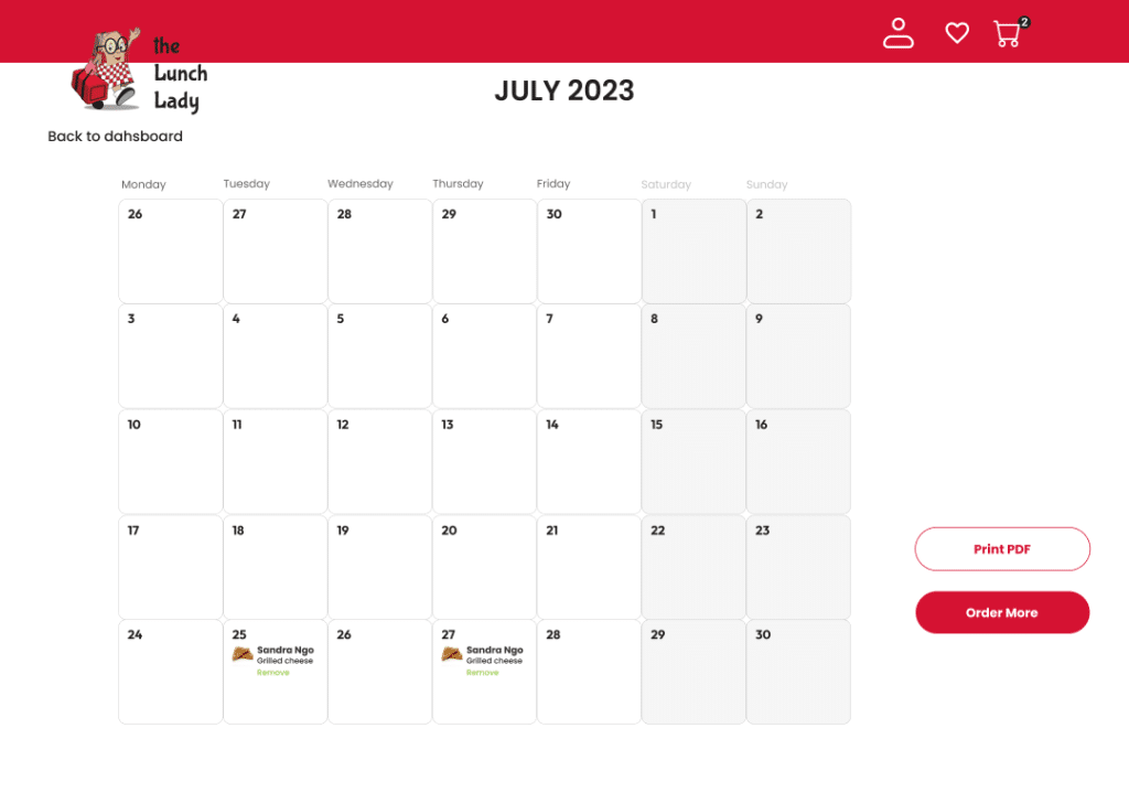
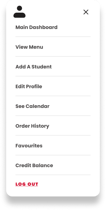
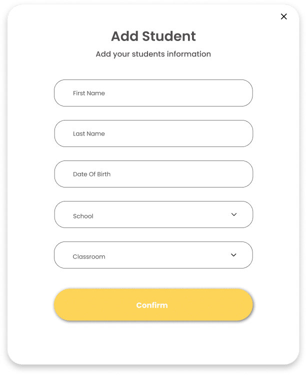
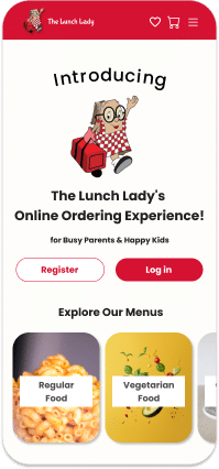
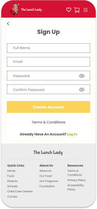
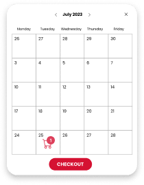
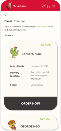
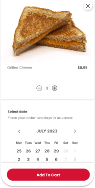
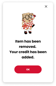
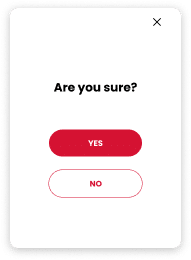
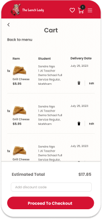
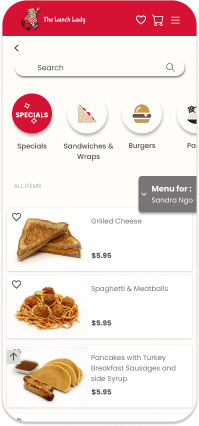
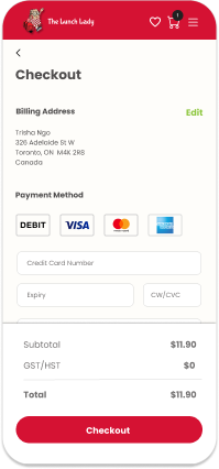
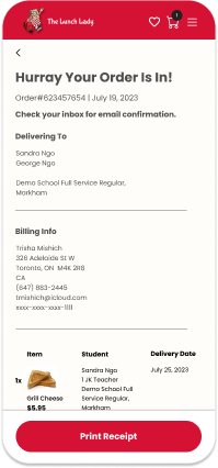
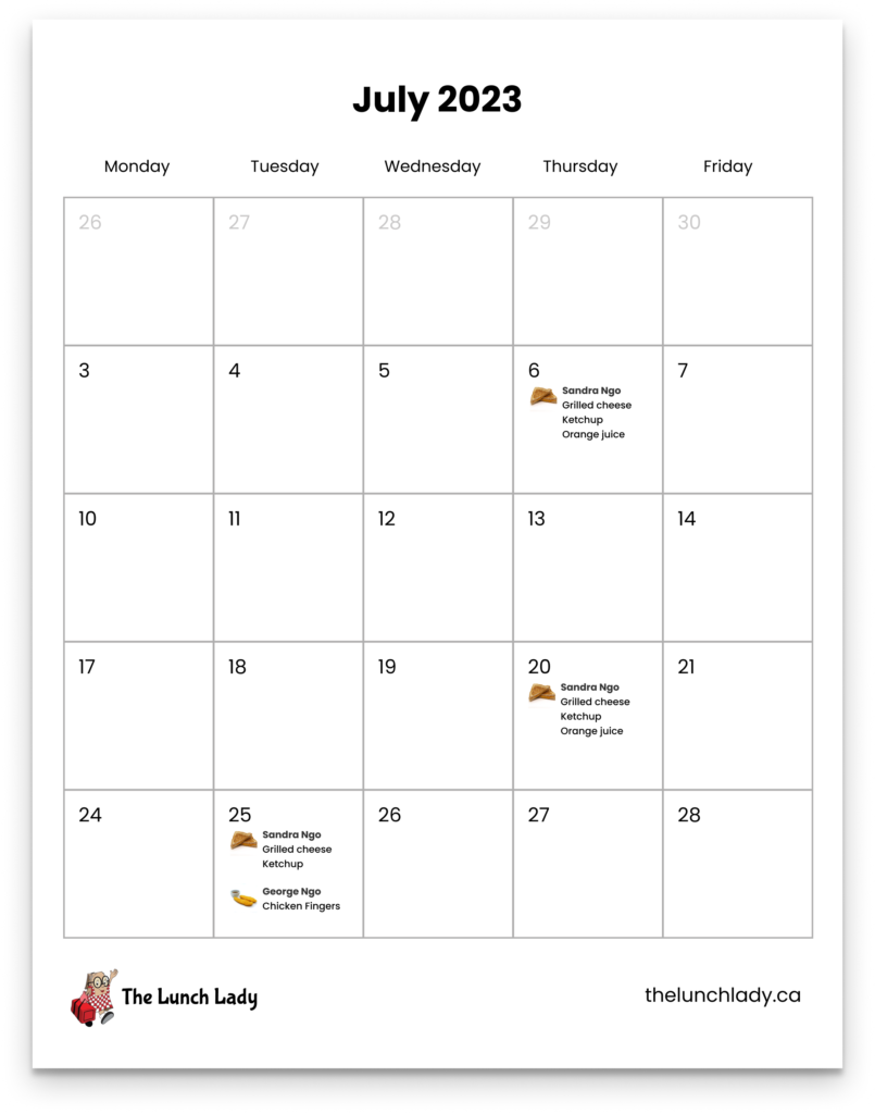
The insights from the second round of usability testing helped refine the low-fidelity wireframes and create more polished prototypes, incorporating branding.
Prototypes for desktop app


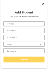
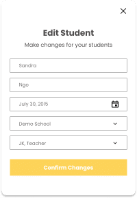
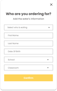
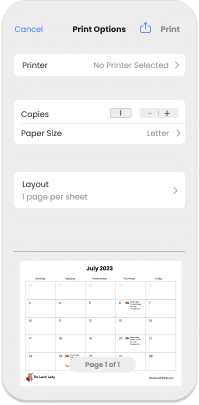
Prototypes for mobile app

Reflection
There was constant communication with the CEO and the development team at each phase of our tests and design. Currently, the development team is working on the first rendition of our prototype resulting from the second series of usability tests. Once completed, we will conduct another series of usability tests.
So far, this UX experience has been very fulfilling, with all parties working seamlessly together. I couldn’t ask for a better UX partner for this project than Trish Create.


